Kendo UI for Angular
Angular TreeList
- Display hierarchical data in an Angular tree grid view that supports sorting, filtering, paging, and much more.
- Part of the Kendo UI for Angular library along with 110+ professionally-designed components.
- Includes support, documentation, demos, virtual classrooms, Visual Studio Code Extensions and more!

-
Hierarchical Data in a Full-featured Grid View
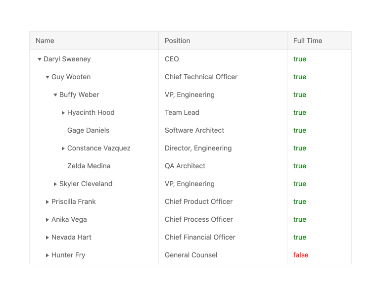
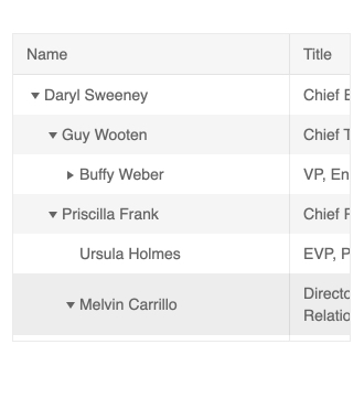
The Kendo UI for Angular Tree List component is one of the most powerful and flexible data components designed for Angular developers looking to display relational data. The Angular Tree Grid is perfect for data that is homogenous and hierarchical, which means all data items have the same fields and each level aligns its columns with the parent and child elements. The Angular Tree Grid comes with critical features, including sorting, filtering, paging, editing and row and column virtualization to assist with handling large datasets. Each column of the Angular TreeList can be resized, reordered by dragging and dropping and hidden through the dedicated column menu. Moreover, users can customize the cells of the Angular TreeList with Angular templates to provide a custom look and feel.
-
Tree Grid Functionality
If you are looking for an angular tree grid, the TreeList component will fit your requirements. Many similar libraries include a tree list view as part of their primary grid feature, set, but the Kendo UI for Angular TreeList component offers it as a focused component. -
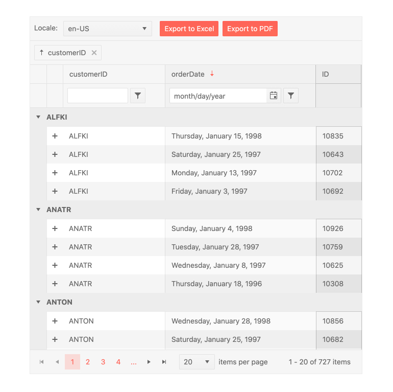
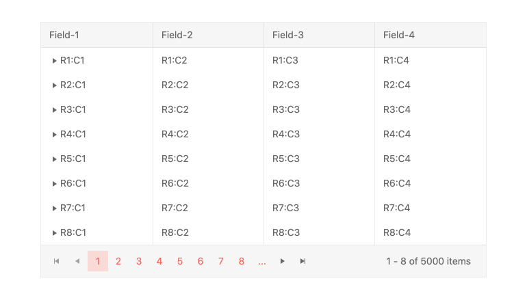
Paging
The Kendo UI for Angular TreeList provides paging through a single configuration option. It enables users to navigate through large datasets by only displaying a subset of the data at a time. The Angular Pager uses helpful UX prompts to assists users to navigate through the available pages and underlying data and customize the number of items per page.
-
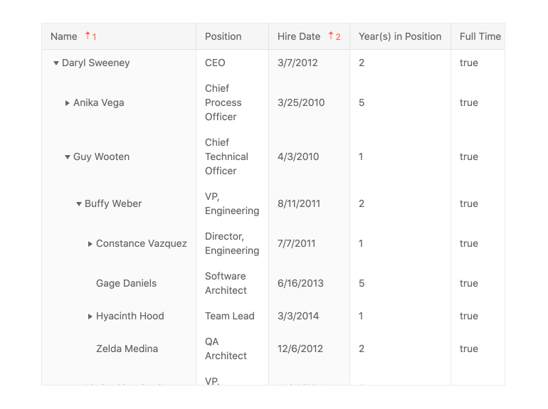
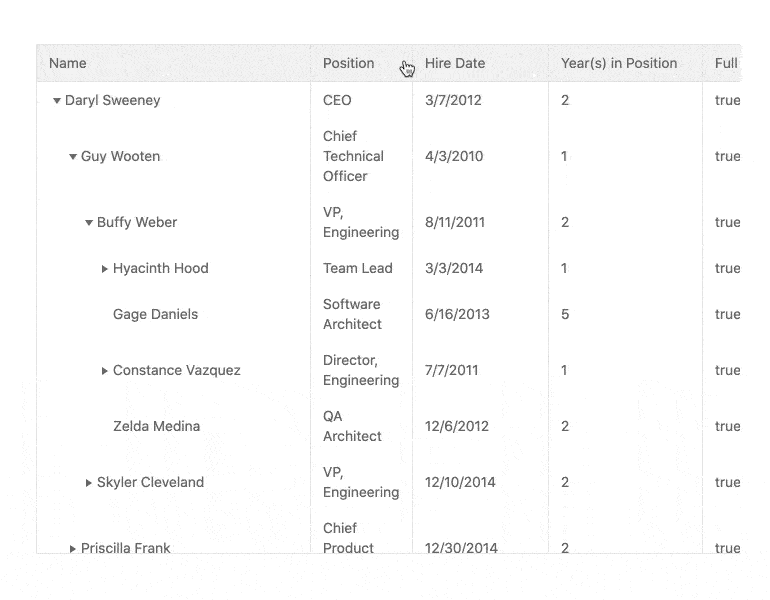
Sorting
With sorting enabled in the Kendo UI for Angular TreeList, any field can be sorted in an ascending or descending order. By simply clicking on a column header, users can cycle through ascending, descending and no sort order. You can also programmatically configure the sort order to be set upon initial page load and to apply to single or multiple columns.
-
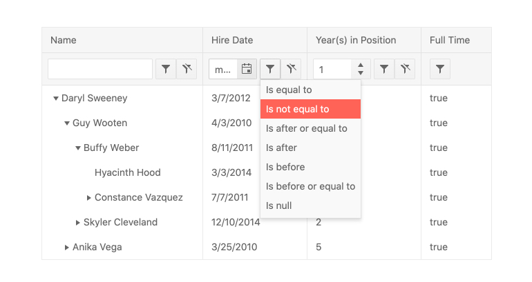
Filtering
The Kendo UI for Angular TreeList provides an intuitive interface for filtering across the various fields. The filtering options can be accessed through a dedicated filter row or a filter icon in each column.
-
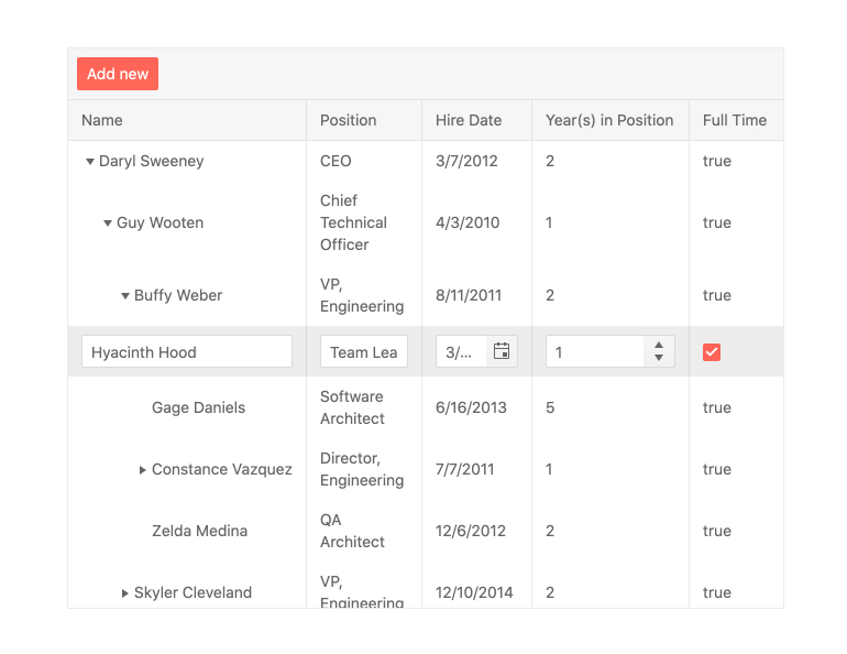
Editing
End users can quickly create, update and delete items when editing is enabled in the Kendo UI for Angular TreeList. The available editing options appear on a cell-by-cell level as users enter or click the cell or on a row-by-row basis to set an entire row in edit mode. Data items can also be edited in an external form.
-
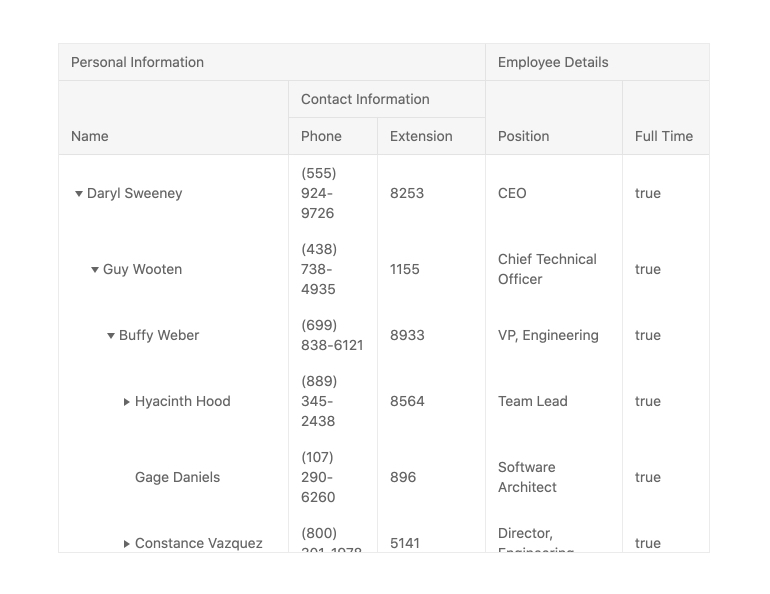
Multi-Header Columns
Multi-header columns allow for columns to be grouped under parent column headers, giving users additional context on how certain columns and fields are related. With the Kendo UI for Angular TreeList, there is no limit to the depth or organization of multi-header columns and the number of column interactions. Reordering and resizing the multi-header columns will apply to all child columns.
-
Column Interactions
Configure the Kendo UI for Angular TreeList columns to be displayed or hidden, reordered by dragging and dropping, or resized using the UI handlers. Interaction options can be enabled or disabled on a column-by-column basis or for the entire column collection.
-
Custom Cell Templates
The Kendo UI for Angular TreeList comes with default UI components to help display data in read or edit modes. Any cell within the Angular Tree Grid can use Angular templates to define its look and feel, ensuring that the Angular Tree Grid can fit in to any custom requirements.
-
Row and Column Virtualization
The Kendo UI for Angular TreeList can easily handle large datasets thanks to the built-in row and column virtualizations. No matter the size of the underlying dataset, users can effortlessly scroll through the dataset both horizontally and vertically.
See Angular TreeList Row and Column Virtualization.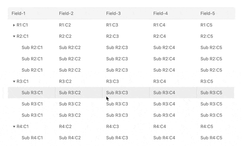
-
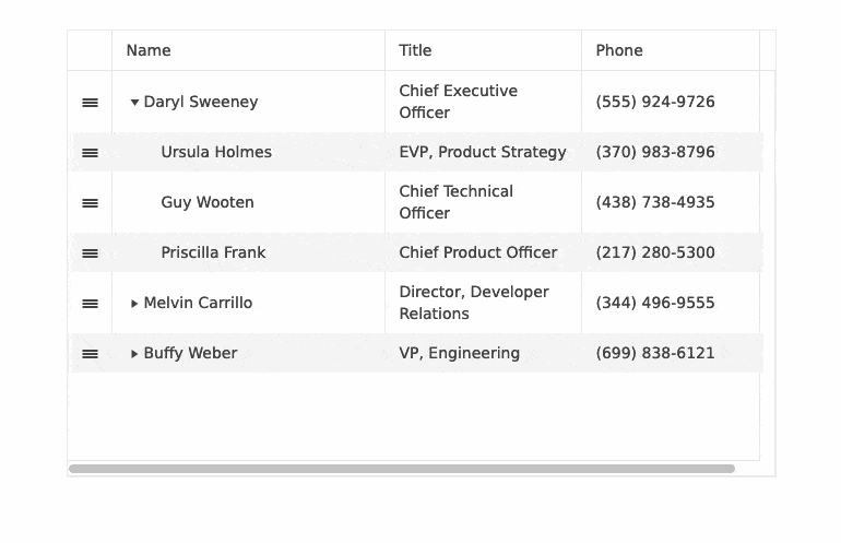
Row Reordering
The Angular TreeList component enables quick and easy row reordering via dragging and dropping. Simply enable the designated attribute and the component will do everything else automatically.
-
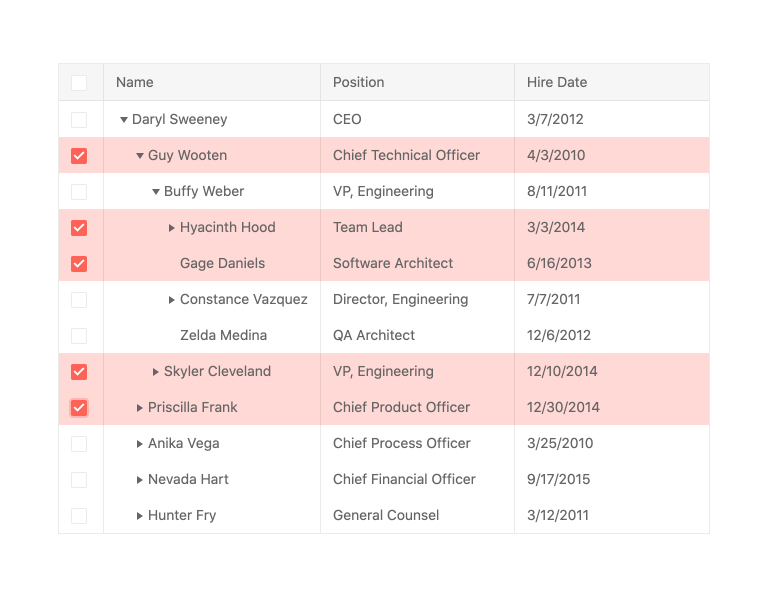
Selection
The Kendo UI for Angular TreeList offers various way to select data items, including directly clicking on a row or via a checkbox column. Additionally, the Angular Tree Grid can programmatically set rows to be selected and provides and API for getting the list of selected items.
-
Frozen Columns
The Kendo UI for Angular TreeList provides the ability to freeze or lock columns on both the right- and left-hand sides of the Angular Tree Grid. What columns are locked can be defined ahead of time, or through the column menu provided within each column.

-
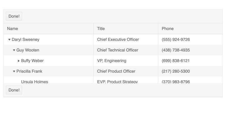
Toolbar Template
Toolbar Templates for the Kendo UI for Angular TreeList allow developers to create custom buttons at the top, bottom, or both at the top and the bottom of the Angular Tree Grid. Out of the box, default toolbar buttons include the PDF Export and Excel Export buttons and with the toolbar template developers can add their own using an Angular template.
-
Responsive Design
Responsive design comes built-in to the Kendo UI for Angular TreeList. This includes responsive columns and settings to help control which columns should be displayed or hidden based on the available viewport, as well as the ability to have a responsive height set.
-
Keyboard Navigation
Every aspect of the Kendo UI for Angular TreeList can be accessed and managed through the Angular Tree Grid’s built-in keyboard navigation.
-
Accessibility
The Kendo UI for Angular TreeList is AAA rated with WCAG 2.0 and is compliant with Section 508 and WAI-ARIA standards.


Get Started with Kendo UI for Angular