Kendo UI for Angular

Angular Data Grid (Table) Component

Get enterprise performance, features, and accessibility – and enjoy implementing it!

  • Best-in-class Angular data grid built for performance with must-have features such as paging, sorting, filtering, grouping and many more.
  • Built natively for Angular to take full advantage of framework performance and features.
  • Part of the 100+ component Kendo UI for Angular library.
kendo-ui-angular-header
logos_customers-2x

Everything You Need in a Grid

100+ features, performance, theming, accessibility, and everything your users expect. Each feature is meticulously documented and easy to implement. Below are just some of the most popular features. 

  • Super Customizable

    Our grid gives you ultimate flexibility whether it is applying themes, using row templates, applying conditional formatting, embedding other components, and just about anything you can think of. The best part is that is just takes a few lines of code.

    Learn More
  • Page, Sort, Filter, Group

    Let users slice and dice their data by providing the UI to do paging, single or multi-column sorting, filtering, or grouping, all through quick configuration options.

    Learn More
  • CRUD

    Choose from various ways to enable CRUD operations such as row by row, individual cells, or external form. The Angular Grid can then work with any Angular service layer to persist changes back to a database.

    Learn More
  • Column Interactions

    Users can toggle between showing or hiding columns, resize and reorder columns, drag columns to be grouped, and more. These options can be applied across all columns or defined on a column-by-column basis.

    Learn More
  • Virtualization

    Enable both row virtualization and column virtualization. Users maintain a buttery smooth scrolling experience in both horizontal and vertical scrolling even when data sets are very large.

    Learn More
  • PDF and Excel Export

    The content of the grid can be exported to either an Excel file or a PDF file with a single button click. A large set of configuration options to ensure any exported file fulfills all requirements.

    Learn More
  • Accessibility

    Accessibility is important but can be tedious. We have it covered. Our Angular Grid is AAA rated with WCAG 2.0 and is compliant with Section 508 and WAI-ARIA standards.

    Learn More
Data Operations

Selection Aggregates

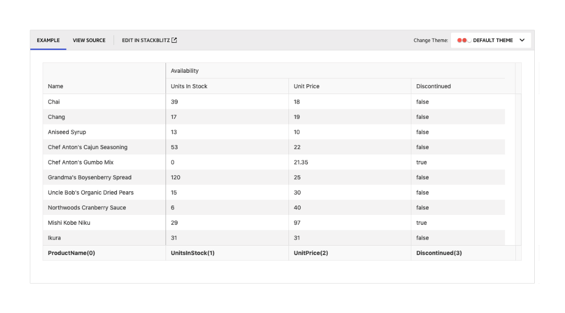
The Angular Data Grid enables you to select a single or multiple cells or rows and calculate different metrics based on the selected data.  This feature allows you to get a quick snapshot of key aggregates for the selected data. You can utilize the built-in approach and display the metrics at the bottom of the Data Grid or create your own elements to present the data based on your specific needs. 

See the Angular Grid Selection Aggregates demo 


Export

Printing

The Angular Grid supports configurable print layout, enabling users to print all grid columns and rows with the corresponding content. Both scrollable and pageable grids can be printed.  

See the Angular Grid Printing demo 

Data Operations

Row Reordering

The Angular Grid component supports row reordering via drag and drop. With this feature enabled, your users can easily rearrange rows and configure their view themselves.

See the Angular Grid Row Reordering demo
Rendering

Compact Rendering Option

Small screens are a primary channel for app delivery and developers are challenged with presenting data grid views in ways that device users can understand. To help solve this need, the Angular Data Grid has a compact rendering mode. In this mode, cell padding will automatically be decreased regardless of which built-in theme is being used (Kendo Default, Material, Fluent, Bootstrap).

See the Angular Compact Grid demo

Data Operations

Column Menu

The column menu provides a convenient way to apply data processing features to the specified columns. The user can sort and filter the grid data, toggle the locked and sticky state of the columns, or change their visibility. You can customize the order of the menu items and create custom controls as necessary.

The Kendo UI for Angular Data Grid also offers the possibility to display the menu items into tabs for even better user experience when managing the grid column settings:

  • Filter tab, including the filter item only 
  • General tab, including the sort, lock, stick, and resize items 
  • Columns tab, including the Column choose item only

See the Angular Data Grid Column Menu demo

Data Operations

Persist Column State

The Angular Data Grid includes highly interactive columns. Users can reorder, size, toggle visibility and much more. When a user configures a highly customized view, they may want to retrieve that view when they return to the page. To help you accomplish that, we have provided an extensive demo.

See Angular Grid Persist State demo

Performance

No Records Template

The Data Grid will display a message when there is no data to display but many developers would like to customize their own. In this case, they can easily do so using the familiar “ng-template”.

See the Angular Grid No Records Template demo

Kendo_Grid_No_Items_Template
Complex Data Tables

Tree View

Many competing data grid libraries have a Tree View mode for displaying hierarchical data, but Kendo UI for Angular includes a dedicated component for this. The TreeView component uses the same performance, data binding flexibility, and customizability found in the Data Grid, but delivers features specific to a Tree View scenario. It is included with Kendo UI, so you get the best of both worlds!
Read about the Angular TreeView component
angular-treeview-overview
Data Operations

Selection

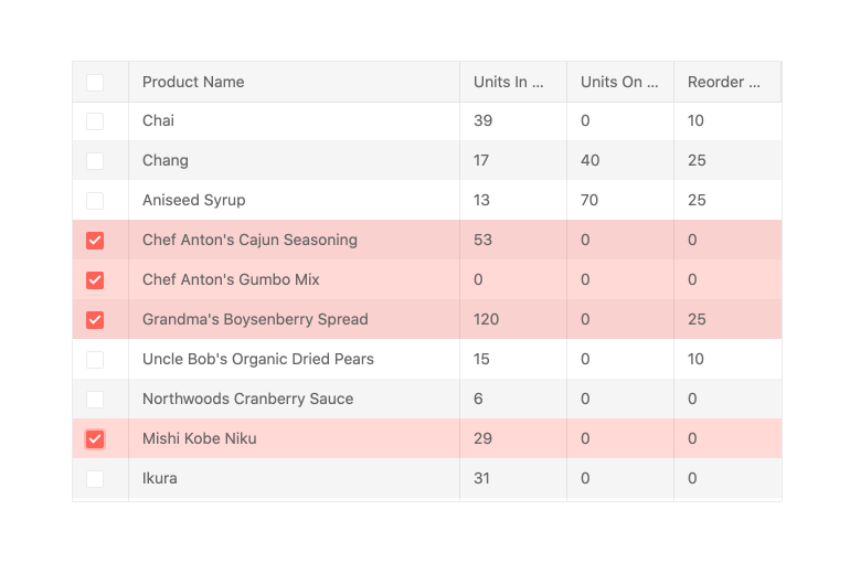
The Kendo UI for Angular Grid features selection in multiple forms, including single row and multi-row selection. You can enable users to select an individual row through clicking on it, select multiple rows by CTRL-clicking on them or through a column of dedicated checkboxes.

The selection capability offers a lot of flexibility - you can perform range selection (shift+click) when not all items to be selected are currently rendered or available on the client, customize the shift-click range selection behavior, and enable adding items to the current selection through the keyboard.  

See Angular Grid Selection demos

angular-grid-selection
Data Operations

Sticky Columns/Rows

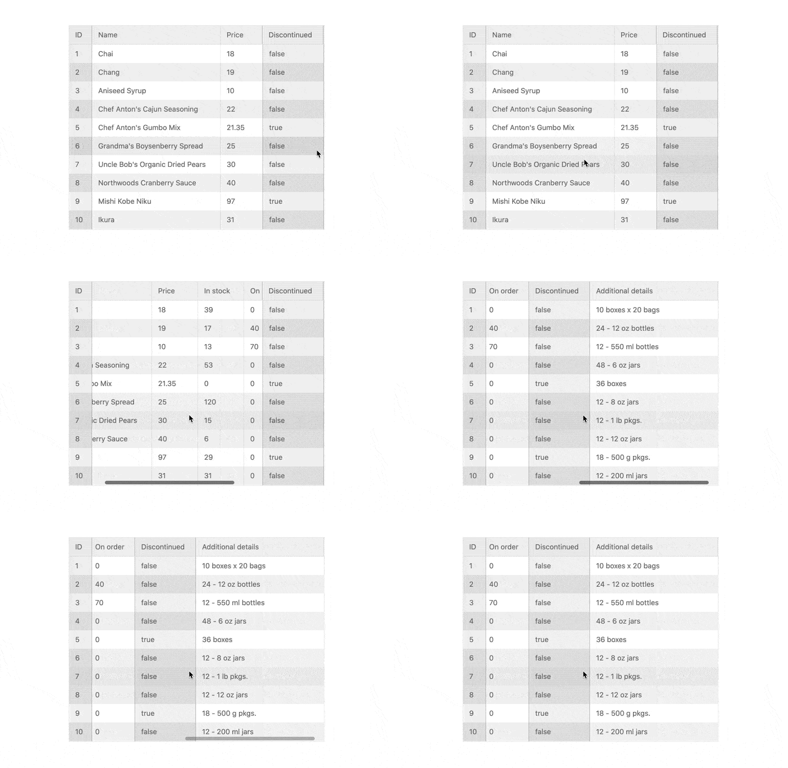
In just a few steps, you can designate one or more columns or rows to always be visible (or stick) to the right or left side or the top or bottom of your grid while the user scrolls. This is a great way to ensure that the most important information is visible when you have limited space.
See the Angular Grid sticky columns and sticky rows demos.
angular-grid-component---sticky-columns
Data Operations

Frozen Columns

The Kendo UI for Angular Grid allows for frozen columns (also known as locked columns) to be configured upon initial rendering or on –the fly. Columns can be added to the left-hand side or right-hand side of the Angular Data Table.
See Angular Grid Frozen Columns demo
angular-grid-frozen-columns
Data Operations

Column Interactions

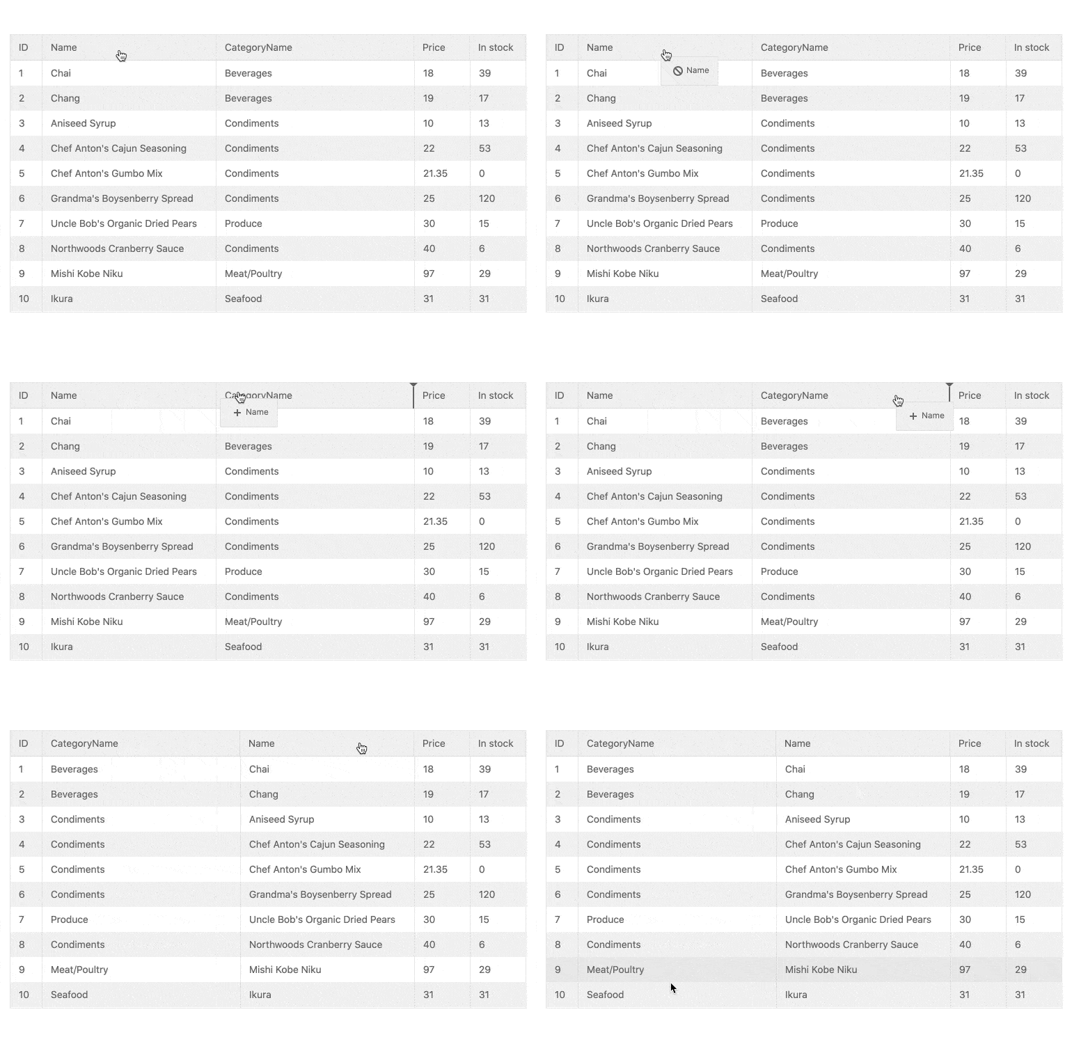
The Kendo UI for Angular Grid provides built-in functionality for various column interactions. Users can toggle between showing or hiding columns, resize and reorder columns, drag columns to be grouped and more. These options can be applied across all columns or defined on a column-by-column basis.
See Angular Grid Column Interactions demos
angular-grid-reordering
Data Operations

Grouping and Aggregates

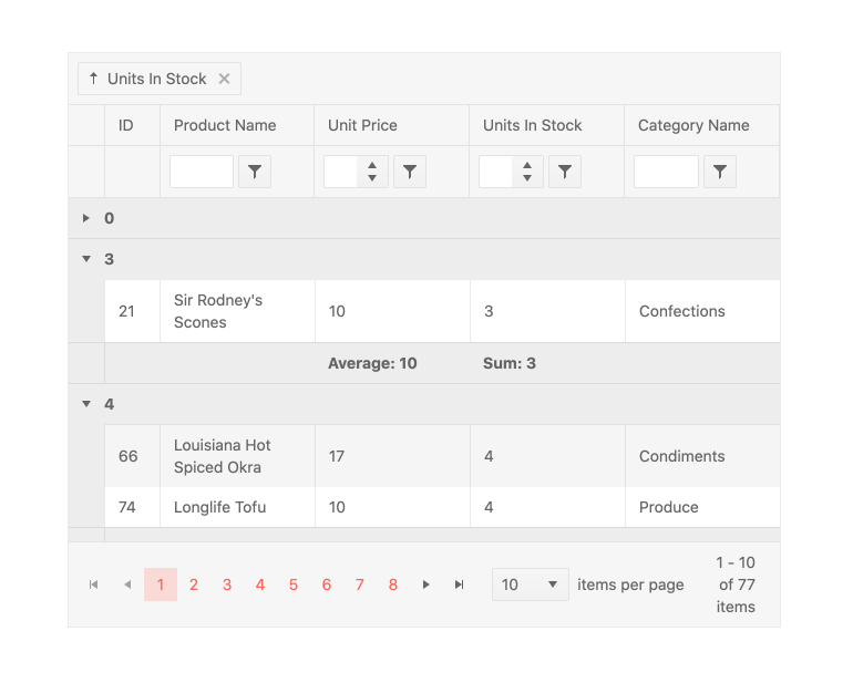
Users can drag and drop columns in the Kendo UI for Angular Grid to group them by field. This is not limited to a single column and there is no limit to the number of groups and subgroups that can be defined. When grouped, each group can be expanded or collapsed by users clicking on the appropriate expand/collapse icons. Each group can also provide aggregate information in both a header and a footer area and each group can be sorted in an ascending or descending order. 
See Angular Grid Grouping and Aggregates demo
angular-grid-grouping
Data Operations

Sorting

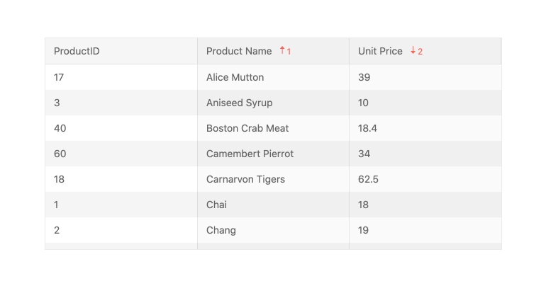
Enable users to sort data items in the Angular Data Table in an ascending or descending order with the Kendo UI for Agular sorting function. Users can click on the column header to cycle through sorting in an ascending, descending or no sort order. You can also allow users to sort a single or multiple columns or disable sorting on a column-by-column basis. Developers can also render the Angular Data Grid with pre-sorted data, defining which columns to sort and in which order ahead of time. 
See Angular Grid Sorting demo
angular-grid-sorting
Data Operations

Filtering

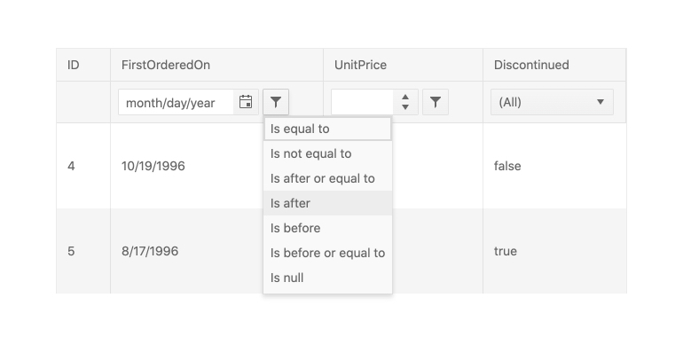
With the out-of-the-box filtering feature of the Kendo UI for Angular Grid, users can quickly slice and dice the data bound to the Angular Data Table with ease. Filtering can be done through a dedicated filter row, which displays a dedicated row just for filters, or through a filter menu that pops up when clicking on a filter icon in the header of a column. The Angular Data Grid can also be extended to provide a custom component to handle filtering, allowing you to have full control over the user experience. 
See Angular Grid Filtering demos
angular-grid-filter-rows
Data Operations

Editing

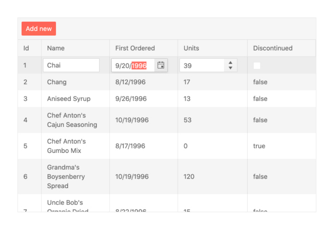
There are various ways user can edit data items in the Kendo UI for Angular Grid. They can edit row by row through a dedicated edit button, edit individual cells by clicking on them or use an external form to edit the currently selected item. The Angular Grid can then work with any Angular service layer to persist changes back to a database. 
See the Angular Data Grid Editing demo
Grid editing
Data Binding

Loading Indicator

The Kendo UI for Angular Data Grid includes a built-in indicator that displays when data operations are in progress. Any time data is loading, the user will see a spinning icon. Custom indicators are supported in cases where you need to implement your own.
See the Angular Data Grid Data Binding demo
Grid loading indicator
Export

Export to Excel and PDF

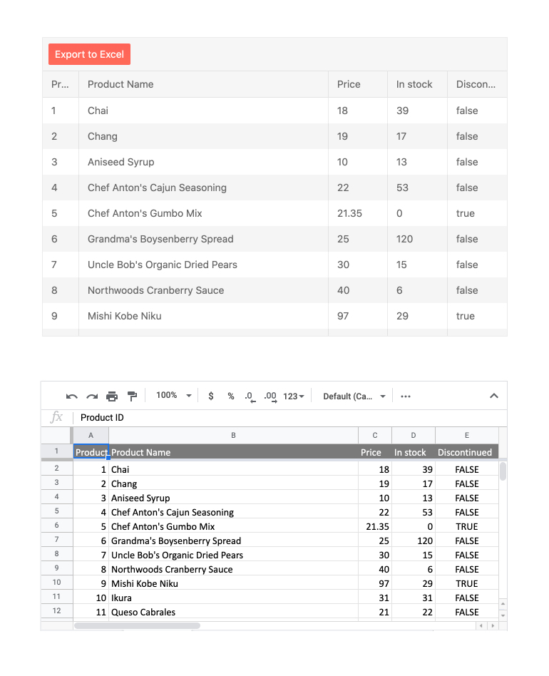
The React Grid features integration with the Excel and PDF Export libraries in the KendoReact library. This integration allows for all content found within the Data Grid to be exported to either Excel or PDF with a single click. With a large set of configuration options available, developers can decide if only the current data set displayed should be exported or if the entire data set should be included in the export, and every exported file can be customized on-the-fly.
See Angular Grid Export to Excel and PDF demos
Kendo UI for Angular Excel Export - UI Component Integration
Complex Data Tables

Master-Detail Tables

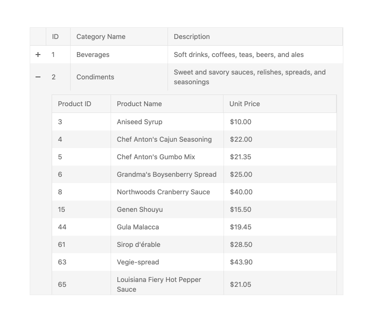
With the built-in Hierarchy feature, the Kendo UI for Angular Grid can showcase multiple Angular Data Tables in a master-detail, also called parent-child, relationship. The hierarchy allows for each Angular Data Table to have its own unique set of features enabled (like sorting, paging, filtering, etc.) based on the data it should display. With no limit for now deep the hierarchy can go, the Angular Data Grid is perfect for displaying any type of related data tables.
See Angular Grid Hierarchy demo
angular-grid-hierarchy
Performance

Live Loading Support

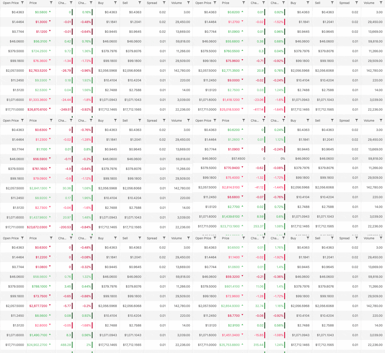
 In many cases, especially in fintech, instant data updates are important. Users want to see data as soon as it changes without needing to explicitly refresh their view. Kendo UI for Angular’s native Grid takes advantage of the Angular framework’s ability to partially update the DOM and can update single cells without retendering the entire view.
Grid Live Loading Support
Performance

Virtual Scrolling (Row and Column)

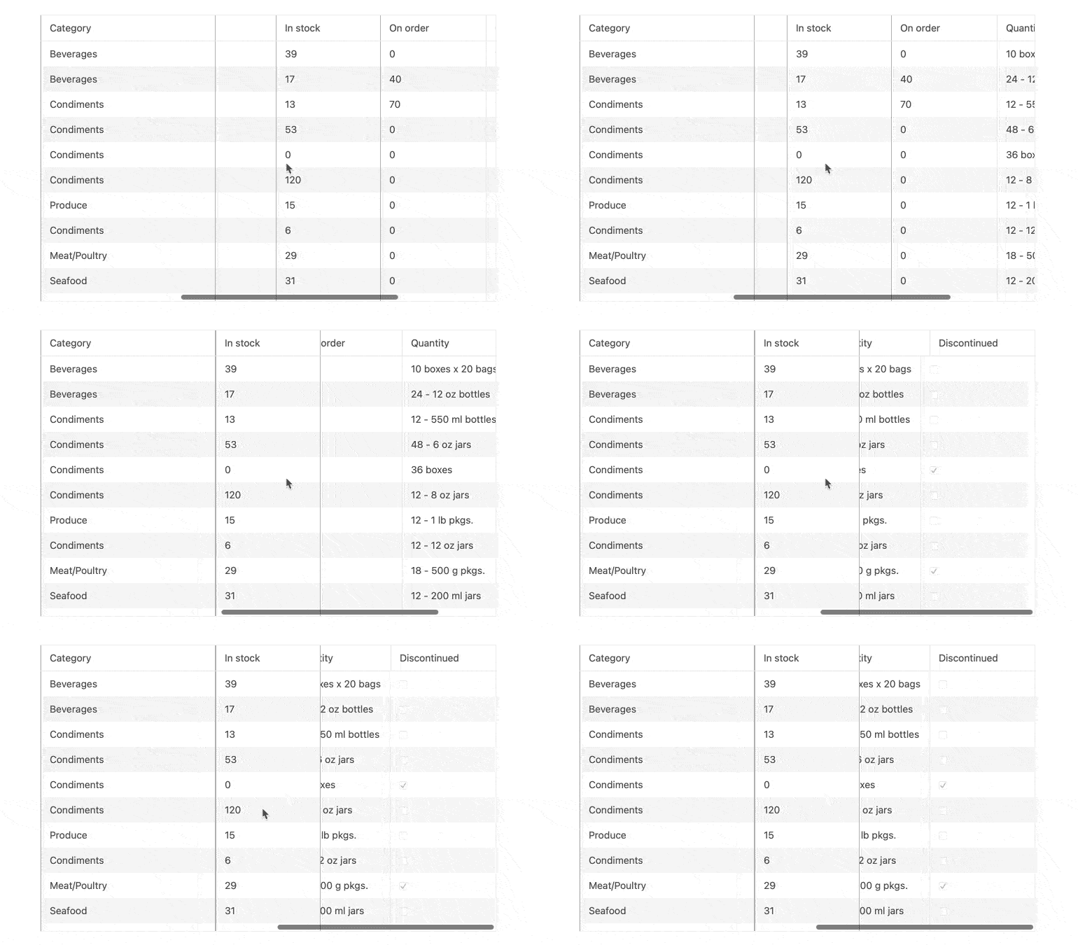
 Virtual scrolling is essentially an alternative method of paging. Rather than have a numbered control used to navigate subsets, each subsequent data subset (or page) is loaded as a user scrolls to the end of the current view. Virtual scrolling can be enabled both for vertical row scrolling and horizontal column scrolling. 
See Angular Grid Virtualization demo.
angular-grid-component---sticky-columns
Performance

Paging

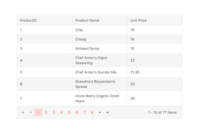
Paging is the most popular method developers use to optimize loading times. With paging implemented, the Grid will only load the number of rows that you specify for a particular page. The Kendo UI for Angular pager is configurable, responsive, accessible, and themable, so implementing it is a breeze.
See the Angular Grid Paging demo
Grid Paging
Performance

Server-side Operations

Perform paging, sorting, filtering, and editing on the server and let the Angular Data Grid consume the results. You can choose to perform these operations on the client as well. It’s completely up to you!
server_communication
inverted-top-curve-blue

Why Developers Love Using the Kendo UI for Angular Data Grid

  • TypeScript for Maintenance and Scalability
  • Blazing Performance
  • Full Accessibility
  • Documentation and Demos
  • Responsive Design
  • Localization and Globalization
  • Customize Everything
  • Themes and Design Systems
  • Integrate with Other Components in Kendo UI for Angular
Angular Data Grid Kendoka
Trust Radius Award

Telerik and Kendo UI Earns Multiple TrustRadius Best of Development 2021 awards

Kendo UI has won Best Feature Set , Best Customer Support and Best Usability.

trust-radius-badge

Kendo UI Earned TrustRadius' Top Rated 2021 award

Progress Kendo UI has earned TrustRadius’ Top Rated Award for Software Components.

The Kendo UI Advantage

We are heavily invested in making sure your experience with the Angular grid is as successful and enjoyable as it can be. We are constantly publishing resources, refining our docs and demos, and even streaming on Twitch. Here is some of our most popular resources.

Frequently Asked Questions

  • What Makes the Kendo UI for Angular Data Grid Better?
  • What are some common use cases for the Kendo UI for Angular Data Grid?
  • Can I try the Kendo UI for Angular Data Grid?

All Angular UI Components