Kendo UI for Angular
Angular Button
- Go beyond the traditional HTML button with theming, text content, images, icons and more.
- Part of the Kendo UI for Angular library along with 110+ professionally-designed components.
- Includes support, documentation, demos, virtual classrooms, Visual Studio Code Extensions and more!
-
Rich Angular Button for Professional Applications
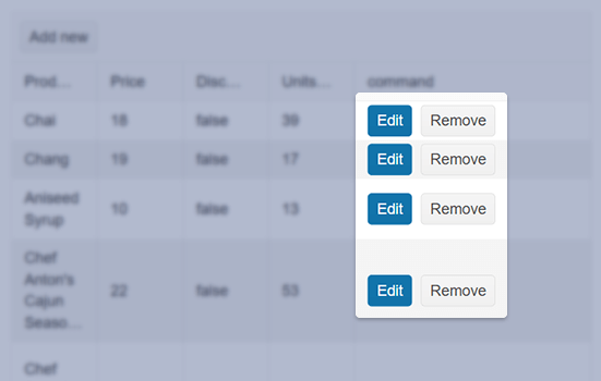
The Kendo UI for Angular Button provides a richer feature set than a standard HTML button along with styling, consistent with the various Kendo UI for Angular themes. The Angular Button comes with support for text content, built-in and custom icons, images, as well as a combination of text and image.

-
Primary Button
To make the Kendo UI for Angular Button stand out, you can enable the Primary Button styling, which gives it a unique look and feel.

-
Toggleable Button
A toggleable Button maintains a state of enabled or disabled upon clicking the component, leaving the component in a particular state after the user has interacted with the button. With the Kendo UI for Angular Button component there are several styles associated with buttons toggled in their on or off states.

-
Icon Button
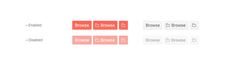
You can enhance the textual content of the Angular Button by adding a predefined or custom icon to it. Choose an icon from our icon libraries like FontAwesome or upload a custom image.

-
Disabled Button
By default, user can interact with the Kendo UI for Angular Button component, but when scenarios call for preventing user interactions, you can disable the button by setting a single configuration option.
-
Globalization
The Kendo UI for Angular Button supports any globalization or localization scenarios. You can enable RTL mode to display the control's text and UI elements from left to right.

-
Accessibility
The Kendo UI for Angular component is compliant with WAI-ARIA and Section 508 standards and is rated AAA for WCAG 2.0.

Get Started with Kendo UI for Angular