Kendo UI for Angular
Angular Box Plot
- Visualize data distribution in quartiles with the Kendo UI for Angular Box Plot Chart.
- Part of the Kendo UI for Angular library along with 110+ professionally-designed components.
- Includes support, documentation, demos, virtual classrooms, Visual Studio Code Extensions and more!
-
Build Powerful Data Visualizations with the Angular Box Plot
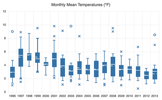
The Kendo UI for Angular Box Plot displays data distribution against six standard numbers: lower or minimum value, first quartile, median, mean, third quartile and upper or maximum value. It enables you to easily compare distributions between multiple groups or datasets, see how values are spread out and spot outliers for each data series as well as zero in on the exact values. The Angular Box Plot component is also a great way to tell if your data is symmetrical or skewed. Its compact shape helps you visualize a large number of datasets in a limited space.
-
Box Plot Elements
The Angular Box Plot chart has a specific anatomy useful for descriptive statistics that includes the following elements:
-
Median – the median is the middle value of the data set, representing the second quartile or the middle percentile
-
Mean – the mean value is the average score of all values in the dataset
-
First Quartile (Q1/25th percentile) – the first quartile represents the middle number between the smallest number and the median of the data set
-
Third Quartile (Q3/75th percentile) – the third quartile represents the middle value between the median and the highest value of the dataset
-
Whiskers – the whiskers are the lines that represent the values outside the first and third quartile
-
Outliers – outliers are data points that are extremely high or low compared to the rest of the values in the dataset
-
Lower Value – the lower or minimum value indicates the smallest number in the dataset
-
Upper Value – the upper or maximum value indicates the largest number in the dataset
-
-
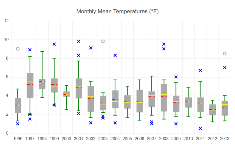
Angular Box Plot Customization Options
You can customize the appearance of all Angular Box Plot elements. Specify the line type for the mean and median (dashed or continuous) and control the appearance of the outlier points and whiskers.

-
Data Binding
You can populate the Angular Box Plot series with data from various source types, including numbers, arrays and objects (or models)—simply specify the fields you want to use.
-
Rendering
The Angular Box Plot chart renders data in the Canvas (bitmap) and SVG (vector graphics) formats. SVG is the default format to ensure an always crips presentation of your data. When performance is the priority, you can easily switch to a canvas format through a single configuration option to ensure your chart will handle large data and real-time updates with no interruption.
-
Export Options
You can export your Angular Box Plot to PDF, SVG, PNG and the Kendo UI drawing format. In scenarios where you need to change the image size or fit the chart to a paper size when exporting to PDF, the intuitive export method of the component will allow you to preserve the quality and rendering of the Chart in the output file.
-
Themes
Customize the series colors of the Kendo UI for Angular Box Plot component with one of our predefined color sets, including Default (our own styling), Material (based on the Material Design guidelines), Bootstrap (resembles the Bootstrap styling) and Fluent (based on Microsoft Fluent UI). You can further customize any of the built-in themes or create a new theme to match your branding using Progress ThemeBuilder.
-
Globalization
The Kendo UI for Angular Box Plot supports globalization and localization to ensure that the component can effectively support any application’s language and locale. You can also enable the right-to-left (RTL) rendering for languages that use right-to-left scripts.

Get Started with Kendo UI for Angular