
Kendo UI for Angular
What's New
What's New HistoryNew Component: Angular PDFViewer
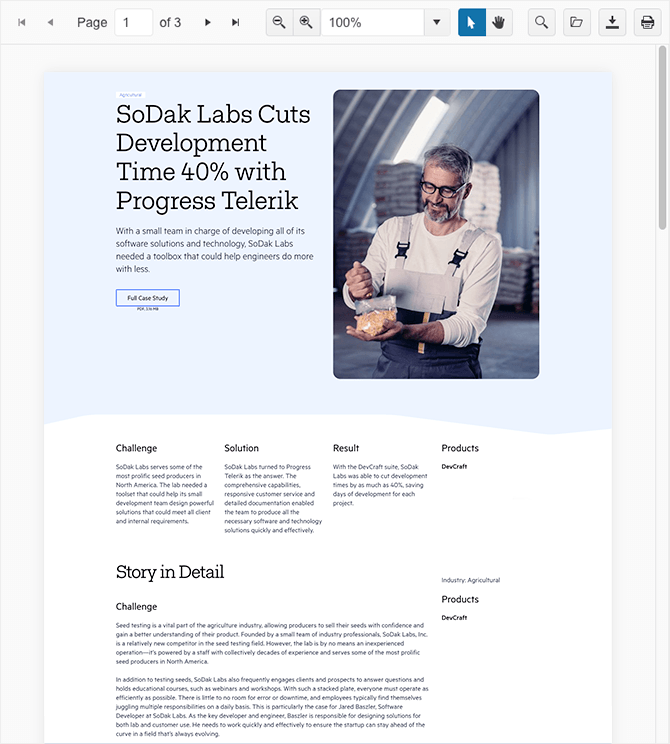
The Kendo UI for Angular PDFViewer component enables users to conveniently view PDF files directly within your Angular application, eliminating the need for third-party software or add-ons.
With intuitive paging mechanisms, powerful search capabilities, and flexible zoom options, users can easily navigate and explore PDF content directly within your Angular application.
By incorporating the Angular PDFViewer component into your projects, you can offer a seamless experience for your users, allowing them to easily view and interact with PDF files without the need to leave your application.
See the Angular PDFViewer demo
Angular Grid Column Menu: Tabbed Interface
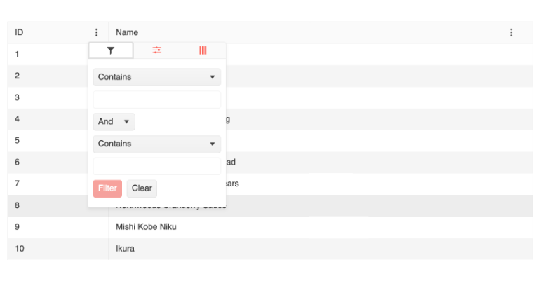
The Kendo UI for Angular Data Grid now introduces a tabbed column menu, offering improved flexibility and a better user experience when managing column settings within the grid.
When the view property is set to "tabbed", the column menu will present a visually appealing and user-friendly design consisting of three tabs, each offering a specific functionality:
Filter: provides an advanced filtering menu, enabling users to apply custom filters and refine data precisely)
Columns Visibility: offers a convenient column chooser, empowering users to control the visibility of each column and customize the grid layout.
More: Under this tab, you can configure additional data grid operations, such as sorting in ascending or descending order, autosizing columns individually or all at once, rearranging column order and more.
See the Angular Data Grid Column Menu demo
Angular Grid: Row Reordering
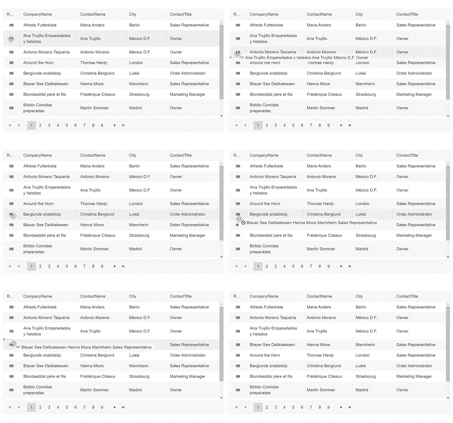
The Angular Data Grid component now supports row reordering via drag and drop. When this feature is enabled, the users can easily rearrange rows and configure the desired view themselves.
See the Angular Grid Row Reordering demo
Angular Grid: Printing
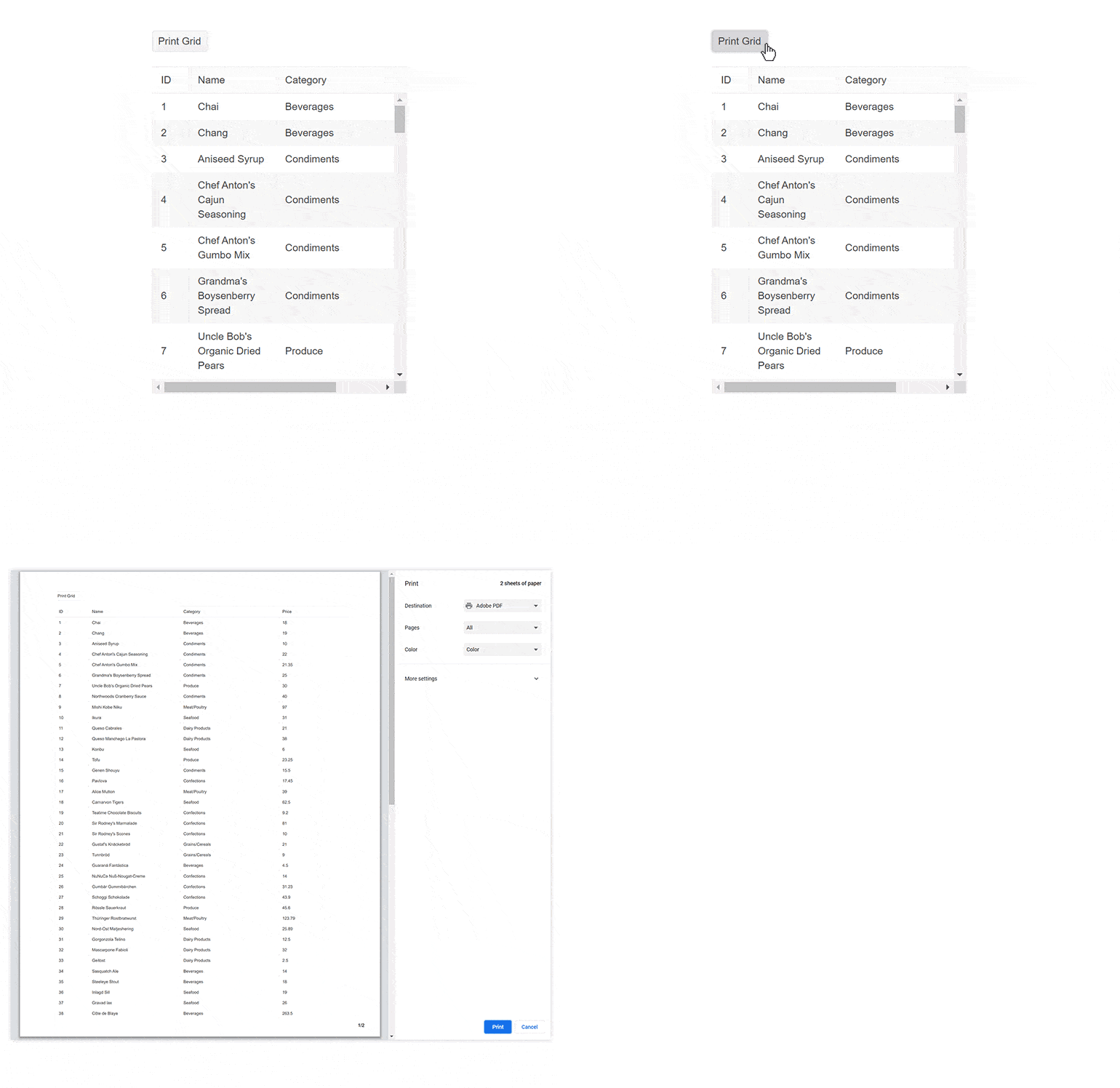
The Angular Data Grid component now supports a configurable print layout, enabling users to print all grid columns and rows along with the corresponding content. Both scrollable and pageable data grids can be printed.
See the Angular Grid Built-in Print demo
Angular Grid: Selection Aggregates
The Angular Data Grid now provides the ability to select a single or multiple cells or rows and calculate various metrics based on the selected data. This feature enables you to get a quick snapshot of key aggregates for the selected data. You can utilize the built-in approach and display the metrics at the bottom of the Grid or create your own elements to present the data as needed.
See the Angular Grid Selection Aggregates demo
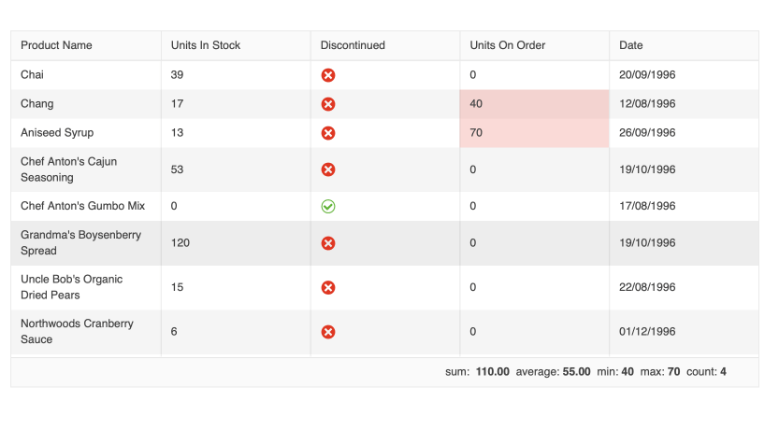
Angular Grid: Enhanced Selection Functionality
Get more flexibility with the enhanced Angular Grid selection functionality, including the possibility to perform range selection when not all items that should be selected are currently rendered and/or available on the client, as well as the option to customize the shift-click range selection behavior.
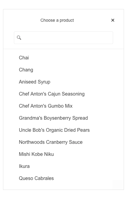
Angular DropDowns and Date Input Components: Adaptive Mode
The Angular DropDown components (incl. AutoComplete, ComboBox, MultiSelect, DropDownList, DropDownTree, MultiSelectTree, and MultiColumnComboBox) and DateInputs (incl. DatePicker, DateTimePicker, TimePicker and DateRange) now support an adaptive mode, enabling a mobile-friendly rendering of the components’ popup. When the mode is enabled, the components automatically adapt to the current screen size and adapt their rendering accordingly.
See the Angular AutoComplete Adaptive Mode demo as an example
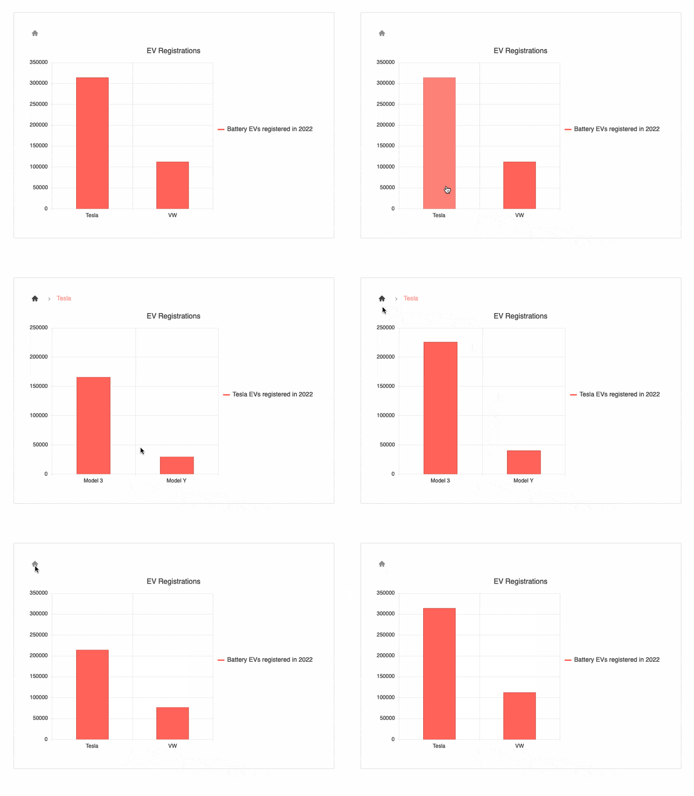
Angular Charts Enhancement: Drilldown
The Angular Charts are now enriched with a drilldown functionality, enabling users to deep dive into specific data. With the drilldown feature, users can clicks on a specific chart element, such as bar or pie segment, and navigate to a different view containing more detailed data about the selected item (e.g. breakdown by product).
See the Angular Charts Drilldown demo
Angular StockChart Enhancement: Navigator Top Position
The Angular StockChart UI component has been enhanced with a new property enabling you to position its navigator on top (in addition to the existing bottom position).
See the Angular StockChart demo

Angular Chart Documentation Enhancements: Ease of Use and New Examples
To give you a better user experience when browsing through the Angular Charts documentation, we’ve introduced a few enhancements:
Content reorganization for a smooth user journey
Logarithmic axis example
Multiline labels example
Sparkline in grid integration example
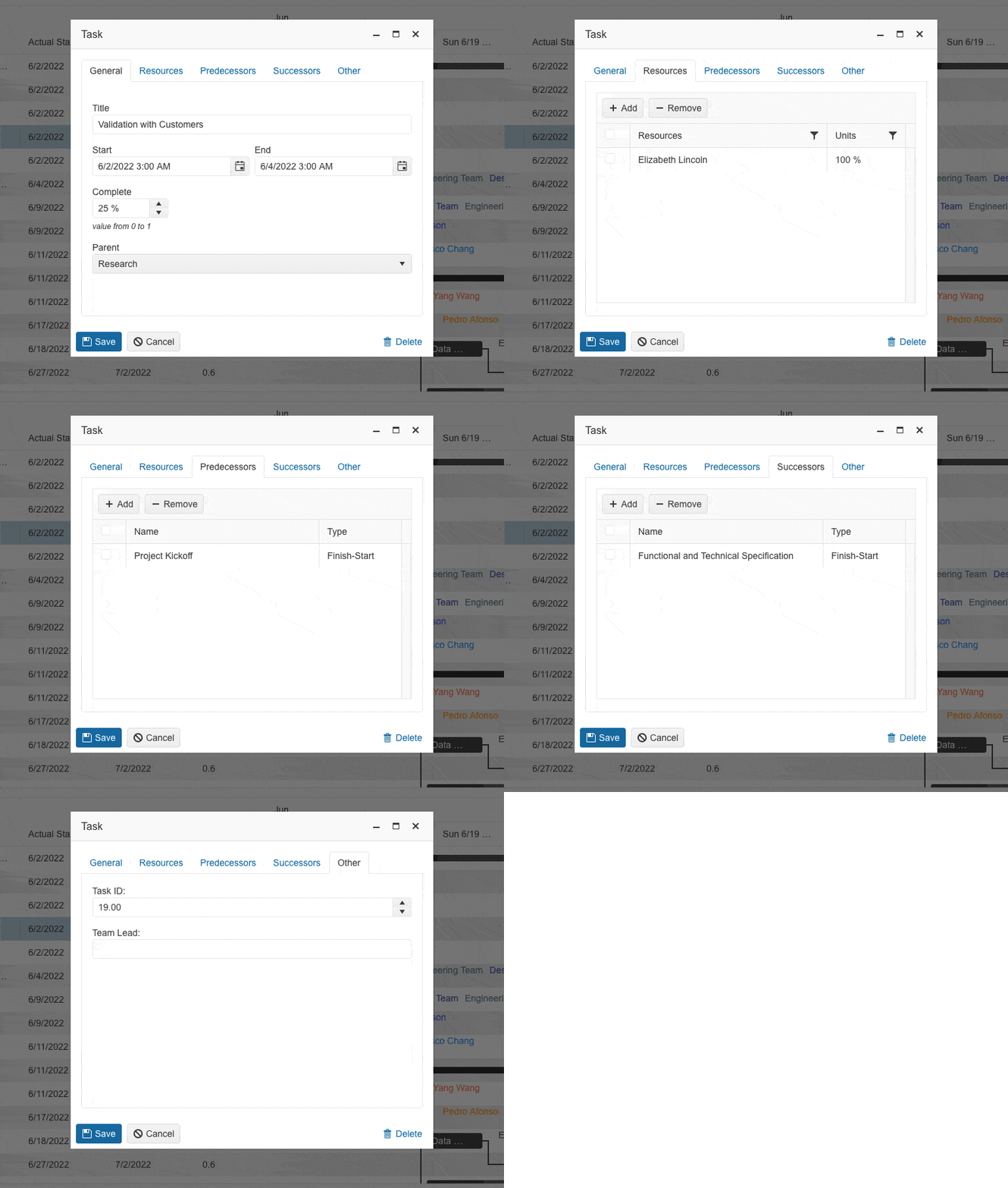
Angular Gantt Enhancement: Redesigned Popup Edit Form
We have redesigned the Angular Gantt Chart’s popup editor for a better user experience. You now have more options when editing tasks, dependencies and resources.
See the Angular Gantt Chart Editing demo
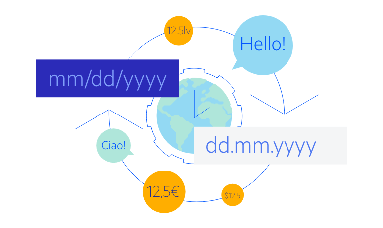
Angular ListBox Enhancement: Globalization
The Kendo UI for Angular ListBox component also added support for Localization. This feature enables developers to provide their own custom cultures for any of the built-in strings contained within the Kendo UI for Angular ListBox. This will help ensure compliance with any specific localization and globalization requirements.
See the Angular ListBox Globalization demo
Angular Dialog Enhancement: Updated Actions Layout
Now you can easily customize the buttons layout by using the layout option of the Angular Dialog component.
See the Angular Dialog Action Buttons demo
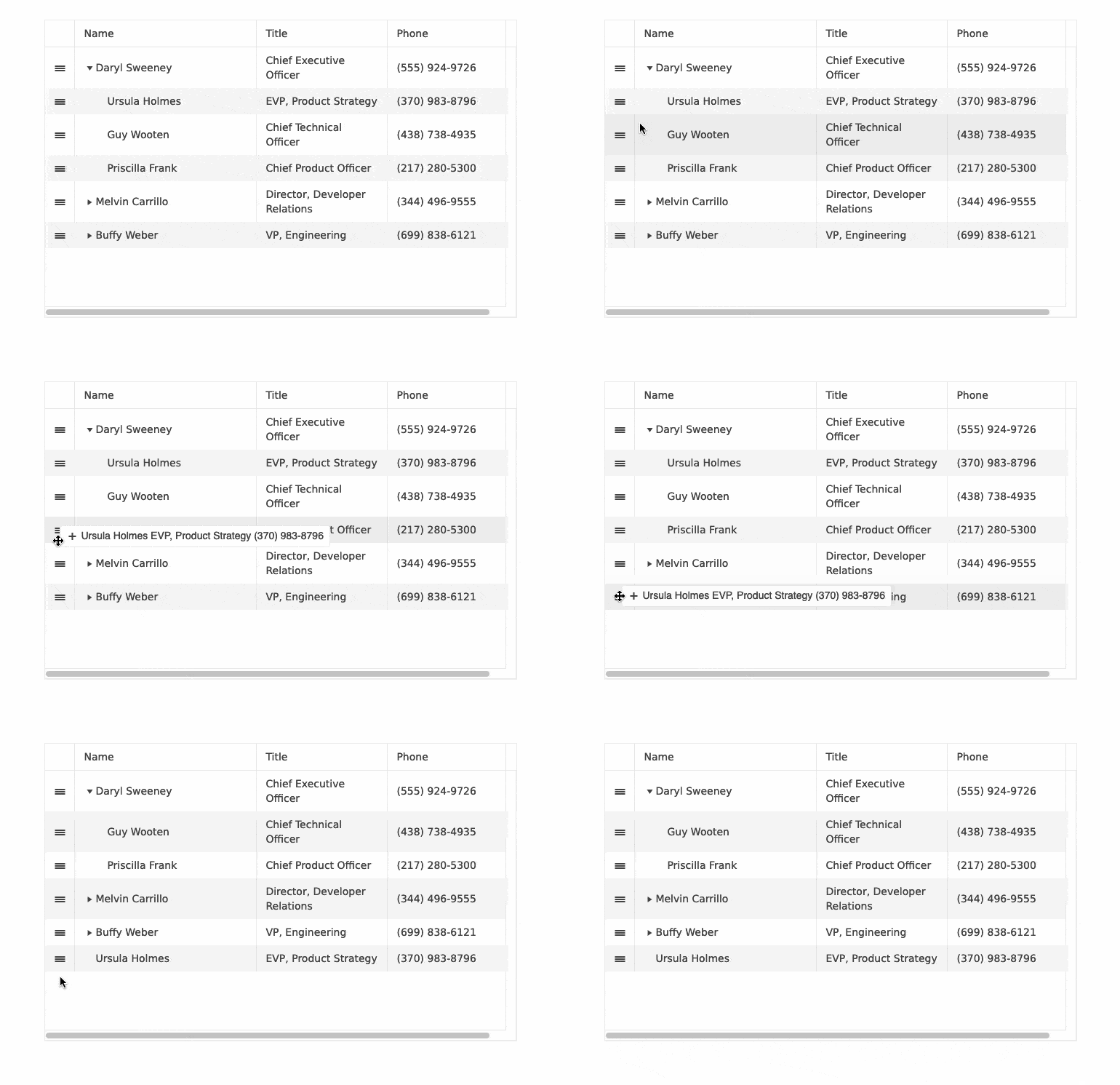
Angular TreeList: Row Reordering
The Angular TreeList component now enables quick and easy row reordering via dragging and dropping. You only need to enable the designated attribute and the component will do everything else automatically.
See the Angular TreeList Row Reordering Demo
Angular ActionSheet Enhancements
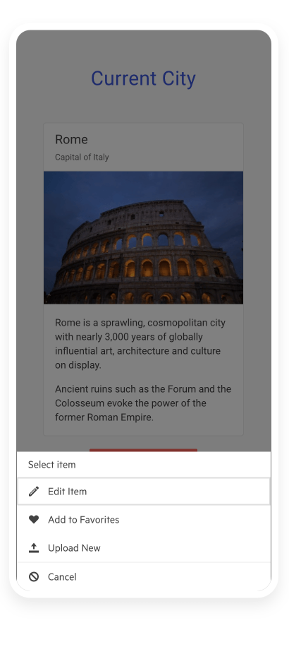
To give you more control over the look and behavior of the Angular ActionSheet, we’ve introduced a few enhancements:
-
Ability to apply a template to the entire component
-
Updated HeaderTemplate rendering scope
-
ExpandedChange, expand and collapse events
-
CssClass and expanded input properties
-
Animations
See the Angular ActionSheet demo
Angular 16 Support
Kendo UI for Angular comes with day one support for Angular 16 allowing you to benefit from the latest features and enhancements offered by the newest Angular version while leveraging the powerful and feature-rich Kendo UI components.
Angular 16 introduces a wide range of exciting improvements, such as enhanced performance, new capabilities, and an improved developer experience. By extending our support to Angular 16, we ensure that you have the opportunity to fully utilize the latest improvements and effortlessly deliver cutting-edge applications.
Check out our blog post on Angular 16

Angular Drag-and-Drop Enhancement: DragTargetContainer & DropTargetContainer
The new Angular DragTargetContainer and DropTargetContainer directives allow you to configure multiple elements in a container as drag or drop items. Thus, users can easily change the item position via drag and drop.
Design System Documentation
One of the key release items in R2 2023 is the launch of a dedicated design system documentation site, which offers a wide range of resources, design assets, and frontend documentation specifically tailored for the Telerik and Kendo UI libraries.
With this initial release, we have included related design and frontend documentation for nearly 20 of the most crucial components.
Our ongoing dedication is to expand this site further, aiming to provide you with all the necessary tools to craft seamless and visually captivating digital experiences and design systems utilizing the power of Telerik and Kendo UI component libraries.
Migration from Font Icons to SVG Icons
With the R2 2023 release, the default icon type in the Kendo UI for Angular components and Kendo UI themes is changed from Font to SVG. By eliminating the font icon inline scripts present in the themes, we have managed to reduce the security risk and improve the overall CSP compliance.
Accessibility Improvements
In 2023, we have prioritized improving the accessibility compliance and available resources for all Kendo UI libraries. In the R2 2023 release, we have made several enhancements in the WAI-ARIA attributes, keyboard navigation, online demos and documentation, and introduced VPAT templates for Kendo UI for Angular.
As a next step, we aim to provide out-of-the box compliance of Kendo components with the new WCAG 2.2 accessibility.
Learn more about the Kendo UI for Angular Accessibility

Kendo UI for Angular - R2 2023
- New Component: Angular PDFViewer
- Angular Grid Column Menu: Tabbed Interface
- Angular Grid: Row Reordering
- Angular Grid: Printing
- Angular Grid: Selection Aggregates
- Angular Grid: Enhanced Selection Functionality
- Angular DropDowns and Date Input Components: Adaptive Mode
- Angular Charts Enhancement: Drilldown
- Angular StockChart Enhancement: Navigator Top Position
- Angular Chart Documentation Enhancements: Ease of Use and New Examples
- Angular Gantt Enhancement: Redesigned Popup Edit Form
- Angular ListBox Enhancement: Globalization
- Angular Dialog Enhancement: Updated Actions Layout
- Angular TreeList: Row Reordering
- Angular ActionSheet Enhancements
- Angular 16 Support
- Angular Drag-and-Drop Enhancement: DragTargetContainer & DropTargetContainer
- Design System Documentation
- Migration from Font Icons to SVG Icons
- Accessibility Improvements


