
Kendo UI for Angular
What's New R3 2022
What's New HistoryAngular Rich Text Editor Enhancement: Allow Users to Set Their Own Font Sizes
On the Angular Editor Toolbar, users will find a font size drop down from which they can select from a predefined list. If the user doesn’t see the size they need, they can manually enter it in the font size field. This lines up with the expected U for today’s editors, but the feature is optional in the case you need to stay with your predefined lists.
See the Angular Editor Tollbar Tools demo

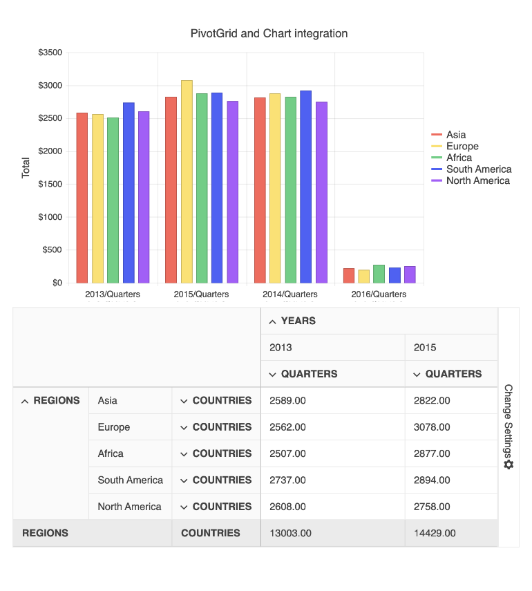
New Angular PivotGrid Demo: Chart Integration
People slicing and dicing data with the PivotGrid will naturally want to see a resulting chart. Along with the RTM release of the PivotGrid, we have added a demo showing how you can integrate it with our Angular Charts component.
See the Angular PivotGrid and Chart demo
New Component: Angular PivotGrid RTM
Previously in Beta, the Angular PivotGrid is now in full production release! While the Beta provided the most basic functionality, this version adds critical features such as:
- Configurator area
- Filtering
- Sorting
- Localization
- Keyboard navigation
- Accessibility compliance

Angular TreeView Enhancement: Disable Only Parent Nodes and Expand Disabled Nodes
For ultimate flexibility, you can choose to disallow selection of parent nodes in the TreeView component rather than the entire component. When you do this, children can still be fully interactive. Additionally, you can load the nodes in expanded state so that the children can be visible. You can also allow expanding/collapsing of disabled nodes.
See the Angular TreeView Disable Parent Fields demo

Angular Dialog Enhancement: Configurable Animations
The Angular Dialog opens with the default animation, but you can customize it to behave to way you like. Use a simple property to change the duration of the animation or choose from a list of built-in animations including slide up, down, left-to-right, and right to left, zoom, fade, and expand.
See the Angular Dialog Animations demo

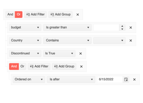
Angular Filter Enhancement: Declarative Initialization
You can now initialize the Filter component declaratively by nesting filter fields (<kendo-filter-field> inside the parent component (<kendo-filter>). This gives you more control over how you implement the Filter since you can implement it field by field.
Visual Studio Productivity Tools Enhancements: Additional Code Snippets and Scaffolders
We have enhanced our popular Visual Studio Code extension with even more Angular snippets and scaffolders to help boost your development productivity. You will find snippets for all Kendo UI for Angular components, JavaScript snippets to accompany the HTML snippet counterparts, and snippets for many popular configuration scenarios with our components. We have also expanded our scaffolders to cover more application scenarios such as these:
- Chart scaffolders for almost all series types including the complex StockChart
- Improved Grid scaffolder with added configuration options and the ability to generate editable Grids
See the Angular Code Snippets documentation

New Angular Data Grid Demo: Save and Restore Column State
The Angular Data Grid includes highly interactive columns. Users can reorder, size, toggle visibility and much more. When a user configures a highly customized view, they may want to retrieve that view when they return to the page. To help you accomplish that, we have provided an extensive demo.
See Angular Grid Persist State demo

New Angular Theme: Microsoft Fluent Design System
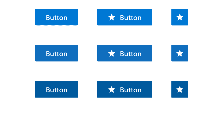
We are excited to announce that the new Fluent theme is officially available with the R3 2022 update for all Telerik and Kendo UI libraries and their web UI components. Just like all our themes, the new Fluent theme follows the guidelines of the official Fluent Design System to allow you to consistently style all your components.
To see the Fluent theme in action, open the Data Grid demo and select the theme.
ThemeBuilder and ThemeBuilder Pro
The ThemeBuilder has long been a popular tool for developers using Kendo UI to customize the style of their components without having to write CSS. It has now been rebuilt for better performance and time-saving features such as the ability to save work and reuse it for multiple projects. For those of you who want to take customization to the next level, we are also introducing ThemeBuilder Pro!
Learn more about the new ThemeBuilder

Angular Data Grid Documentation Update
As with all the Kendo UI for Angular components, we want to make your experience with the Data Grid is as productive and enjoyable as possible. Following that mission, we have reviewed and updated the documentation for better organization and more detail.
New Component: Angular Drag and Drop
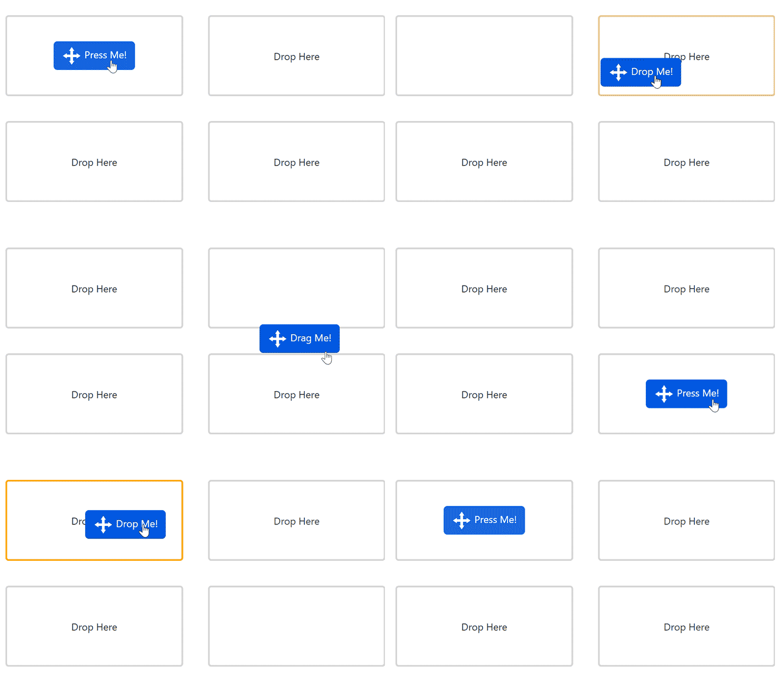
The Angular Drag and Drop library makes it easy to provide your users with features to grab items and drag them to drop zones on the screen. The component provides the ability to drag an element on the page and drop it in another element. You specify what items can be dragged and what items can be used as drop zones. They can be generic HTML elements or other Kendo UI for Angular components.
See the Angular Drag and Drop demo
New Component: Angular CircularProgressBar
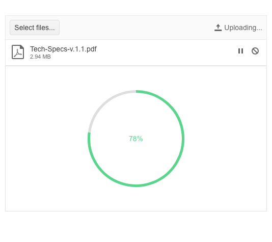
The Angular CircularProgressBar is an alternative to the linear progress bar and shows progress as a colored line on a circle. When the circle is complete, progress is complete. You have total control to make it your own—map colors to ranges (e.g., up to 10% is red), format the middle label, set the size, and much more.
See the Angular CircularProgressBar demo
Angular Filter Enhancement: Use Templates for Custom Rendering
The Angular Filter allows you to apply your own Angular template to customize the formatting for the value of the expression builder to your requirements. Date formatting is a common example.
See the Angular Filter Templates demo
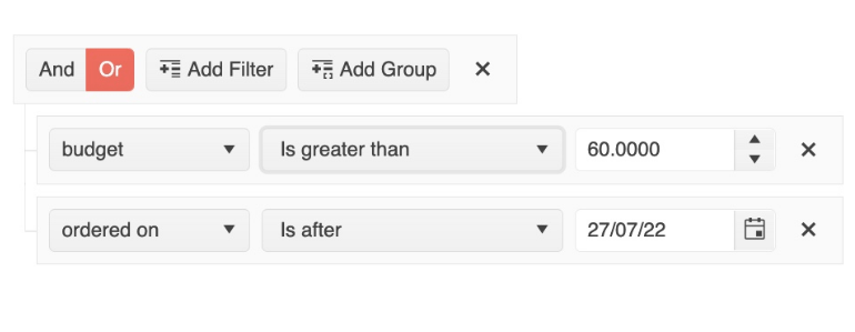
Angular Filter Enhancement: Set Default Filter Formats
When using the building expressions with the Angular Filter, users can enter date and numeric parameters (among others). Chances are that your requirements dictate that the numeric value be in a specific format. For your convenience, you can set the default format for these inputs.
See the Angular Filter Editor Formats demo
Angular Data Grid Enhancement: Max Resizable Width Property for Columns
While we strive to make the Angular Data Grid views as customizable as possible for your users, we recognize that you may need to set some limits. To that end, we have added a new property that allows you to set the max width to which a user can resize a column. You can set the property on a column-by-column basis.
Angular Data Grid Accessibility Enhancement: Configurable Navigable Sections
For an additional level of control, you can enable keyboard navigation for individual elements separately (Grid vs. Pager, for example). Before, keyboard navigation was enabled/disabled for the entire component.
See the Angular Data Grid Navigable Sections demo

Angular Chart Enhancement: Subtitle Property
A subtitle property has been added to all Angular Charts in order to make it easy to add text under the main title element.
Angular Drawer Menu Enhancement: Hierarchical Items
Render a hierarchical menu with parent and child nodes to help users navigate directly to where they want to go. Bind the menu to hierarchal or flat data with relationships and automatically create menus and submenus or bind the Angular Drawer to multiple data sources and designate parents and children on your own.
See the Angular Drawer Menu Hierarchical Drawer demo
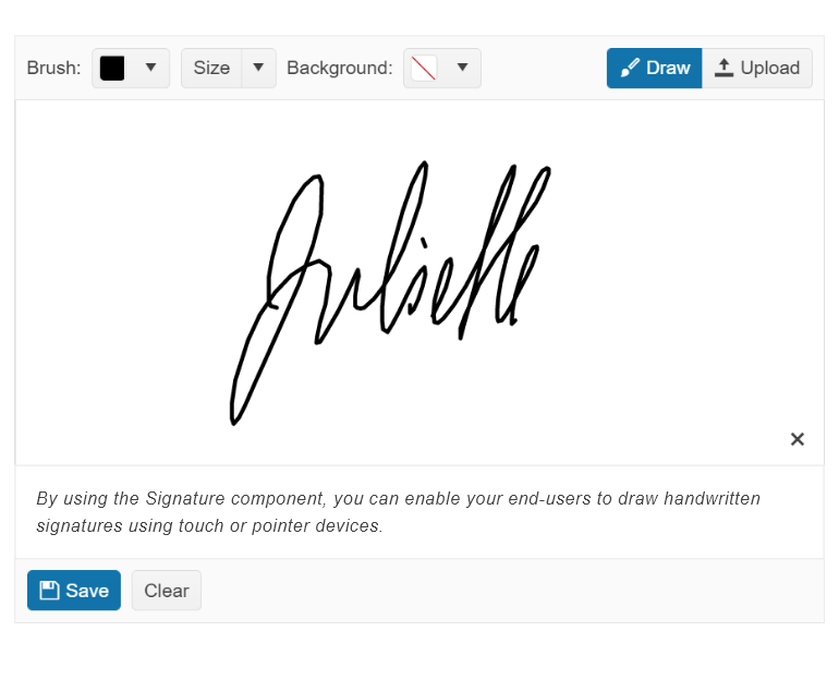
New Component: Angular Signature
The Angular Signature component provides you with an easy way to enable your users to upload their signature for documents that require it. It includes all the features you need to provide a first-class e-document application. Highlights are forms support, line smoothing, styling properties, popup support, and events API.
See the Angular Signature component demo
Kendo UI for Angular - R3 2022
- Angular Rich Text Editor Enhancement: Allow Users to Set Their Own Font Sizes
- New Angular PivotGrid Demo: Chart Integration
- New Component: Angular PivotGrid RTM
- Angular TreeView Enhancement: Disable Only Parent Nodes and Expand Disabled Nodes
- Angular Dialog Enhancement: Configurable Animations
- Angular Filter Enhancement: Declarative Initialization
- Visual Studio Productivity Tools Enhancements: Additional Code Snippets and Scaffolders
- New Angular Data Grid Demo: Save and Restore Column State
- New Angular Theme: Microsoft Fluent Design System
- ThemeBuilder and ThemeBuilder Pro
- Angular Data Grid Documentation Update
- New Component: Angular Drag and Drop
- New Component: Angular CircularProgressBar
- Angular Filter Enhancement: Use Templates for Custom Rendering
- Angular Filter Enhancement: Set Default Filter Formats
- Angular Data Grid Enhancement: Max Resizable Width Property for Columns
- Angular Data Grid Accessibility Enhancement: Configurable Navigable Sections
- Angular Chart Enhancement: Subtitle Property
- Angular Drawer Menu Enhancement: Hierarchical Items
- New Component: Angular Signature


