Kendo UI for Angular
Angular Donut Chart
- Display a total split by its dimensions with the Kendo UI for Angular Donut Chart.
- Part of the Kendo UI for Angular library along with 110+ professionally-designed components.
- Includes support, documentation, demos, virtual classrooms, Visual Studio Code Extensions and more!
-
Build Powerful Data Visualizations with the Angular Donut Chart
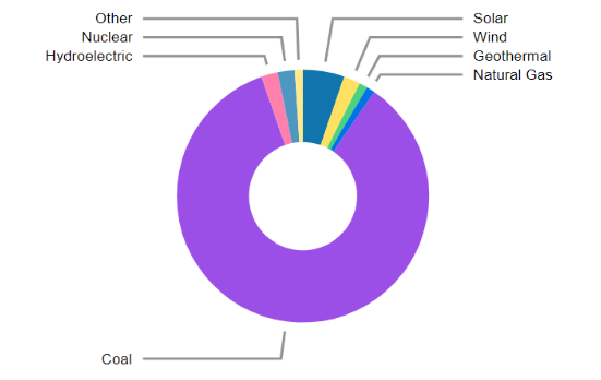
The Kendo UI for Angular Donut Chart displays how a total is divided by its parts in a circular graph with slices. An advanced version of the Angular Pie Chart, the Donut Chart can display multiple nested series as outer segments or rings of the circle. The central blank space, built-in legend and series labels allow you to add contextual information, helping users easily understand and interpret the data.
-
Data Binding
You can populate the Angular Donut Chart series with data from various source types, including numbers, arrays and objects (or models)—simply specify the fields you want to use during configuration.
-
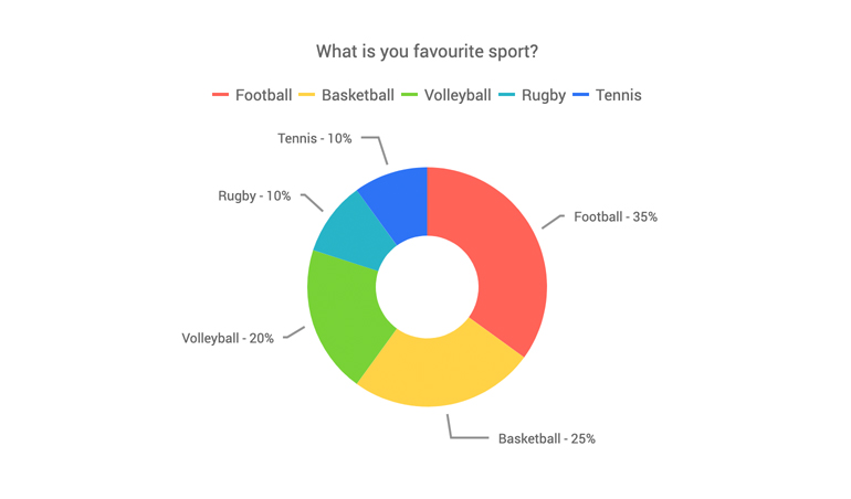
Donut Chart Labels
Leverage the built-in Angular Donut Chart labels feature to help users navigate the data. You can configure the labels’ position to be inside the donut slices or outside the circle. When you need to visualize a large number of variables, opt to place the labels outside the slices to avoid a cluttered presentation and choose to align them either in a circle around or a column to the left or right of the chart. A handy auto-fit option allows you to wrap the labels’ content inside the plot area.
-
Multiple Series
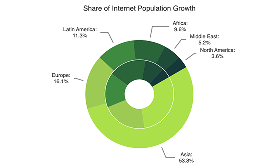
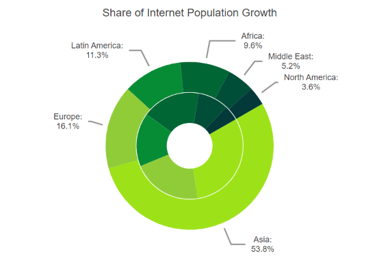
The Kendo UI for Angular Donut Chart supports multiple data series. Each data series you plot adds a ring to the chart, starting from the center of the chart. A pop-up label will display information about the variable upon hovering over the corresponding inner slice.
-
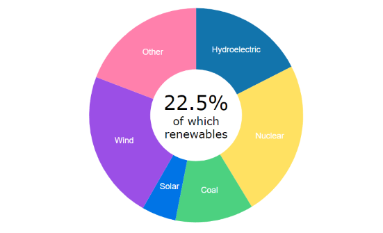
Displaying Information in the Donut Chart Center
Place custom content in the center of the Angular Donut Chart using the Center template or drawing visuals. The Center template is an HTML overlay you can position over the center of your chart while the drawing visual is a vector element that has the advantage of rendering its contents as an integral part of the component when exported.
-
Rendering
The Angular Donut Chart renders data in the Canvas (bitmap) and SVG (vector graphics) formats. SVG is the default format to ensure an always crips presentation of your data. When performance is the priority, you can easily switch to a canvas format through a single configuration option to ensure your chart will handle large data and real-time updates with no interruption.
-
Export Options
You can export your Angular Donut Chart to PDF, SVG, PNG and the Kendo UI drawing format. In scenarios where you need to change the image size or fit the chart to a paper size when exporting to PDF, the intuitive export method of the component will allow you to preserve the quality and rendering of the Donut chart in the output file.
-
Themes
Customize the series colors of the Kendo UI for Angular Donut component with one of our predefined color sets, including Default (our own styling), Material (based on the Material Design guidelines), Bootstrap (resembles the Bootstrap styling) and Fluent (based on Microsoft Fluent UI). You can further customize any of the built-in themes or create a new theme to match your branding using Progress ThemeBuilder.
-
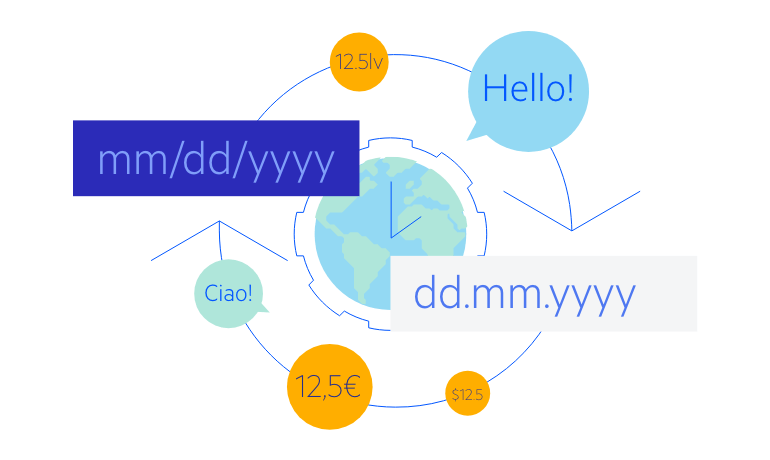
Globalization
The Kendo UI for Angular Donut Chart supports globalization and localization to ensure that the component can effectively support any application’s language and locale. You can also enable the right-to-left (RTL) rendering for languages that use right-to-left scripts.

Get Started with Kendo UI for Angular