
Kendo UI for Vue
What's New R3 2022
What's New HistoryNew Component: Vue FlatColorPicker
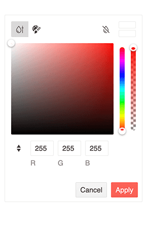
The Vue FlatColorPicker component helps your users choose colors from a gradient or palette view. It’s a complete color editor that gives users interactive controls for simply selecting a color or altering its opacity, hue, RBG, and Hex values. This component is an alternative to the Vue ColorPicker. The ColorPicker component displays the color editor in a popup while the FlatColorPicker renders the editor right on the page.
See the Vue FlatColorPicker demo
New Vue Theme: Microsoft Fluent Design System
With R3 2022, we are excited to announce that the new Fluent theme is officially available for all Telerik and Kendo UI libraries and their web UI components! Just like our other themes, the new Fluent theme follows the guidelines of the official Fluent Design System so that all components are immediately styled with the Fluent Design System just by including the new theme.
To see the theme in action, visit the Data Grid demo and choose the Fluent theme.
Vue Inputs Enhancement: Suffixes and Prefixes
The Kendo UI for Vue Input components now feature the ability to add custom elements before the input element (a prefix) or after the input element (suffix). This new feature, also called “adornments,” lets you customize all Kendo UI for Vue input elements without needing to deeply modify the components through source code, making these input components extremely flexible.
Vue Documentation Enhancement: API Redesign
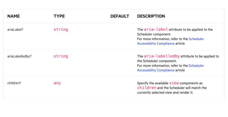
We have revamped the remainder of the API docs to make them more detailed and user-friendly.
See the Vue Data Grid API documentation
New Component: Vue ColorPalette
The Vue ColorPalette renders a set of predefined colors from which users can select. You can choose from the built-in color presets or define your own. A simple use case for the Vue ColorPalette component is enabling users to preview the available colors for a product they are buying online. A more complex example is using the ColorPalette within a full-featured color picker tool such as the Vue ColorPicker component.

Vue Data Grid: Updated Filtering Examples
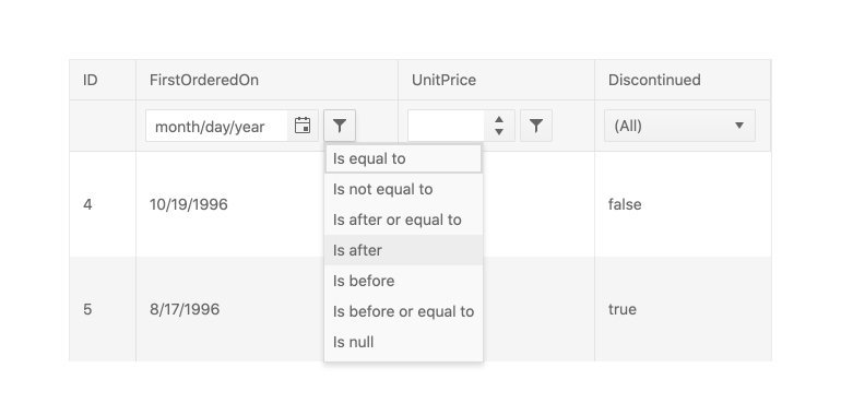
The Vue Data Grid supports many filtering scenarios, from the most basic to the most complex. To ensure you can successfully satisfy requirements, we have added various examples to the documentation. These include using the column menu to filter data and using an external interface for filtering.
See the Vue Data Grid Filtering demos
Vue Data Grid Enhancement: Loading Indicator
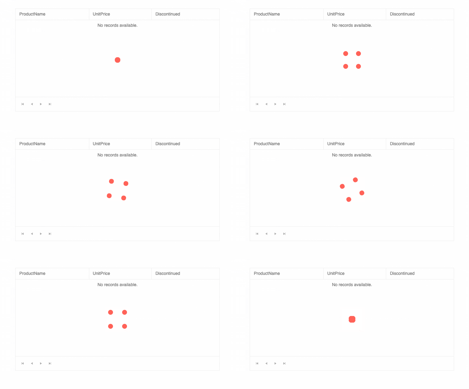
The Kendo UI for Vue Data Grid includes a built-in indicator that displays when data operations are in progress. Any time data is loading, the user will see a spinning icon. Custom indicators are supported in cases where you need to implement your own.
ThemeBuilder and ThemeBuilder Pro
The ThemeBuilder has long been a popular tool for developers using Kendo UI to customize the style of their components without having to write CSS. It has now been rebuilt for better performance and time-saving features such as the ability to save work and reuse it for multiple projects. For those of you who want to take customization to the next level, we are also introducing ThemeBuilder Pro!
Learn more about the new ThemeBuilder

Vue Data Grid Enhancement: Filtering, Dynamic Column Display
The Vue Data Grid supports scenarios where developers need to update columns when the underlying data model changes. This can include both showing and hiding columns as well as applying filters.
New Component: Vue ColorGradient
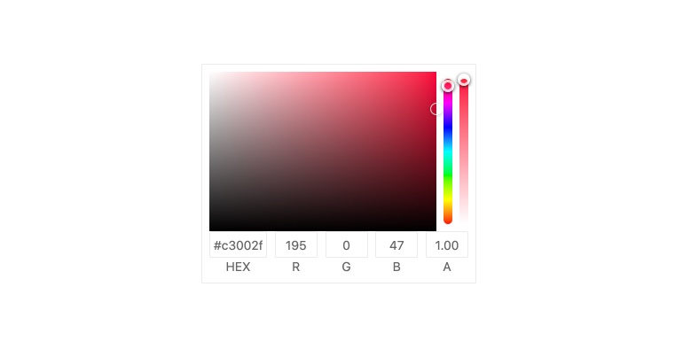
The Vue ColorGradient helps users select colors by rendering a gradient map users can click on to select a shade of a particular color. The component also included a hue slider for selecting the base color, opacity slider and inputs for RBG or HEX values.
See the Vue ColorGradient demo
New Vue Grid Demo: Sticky Rows
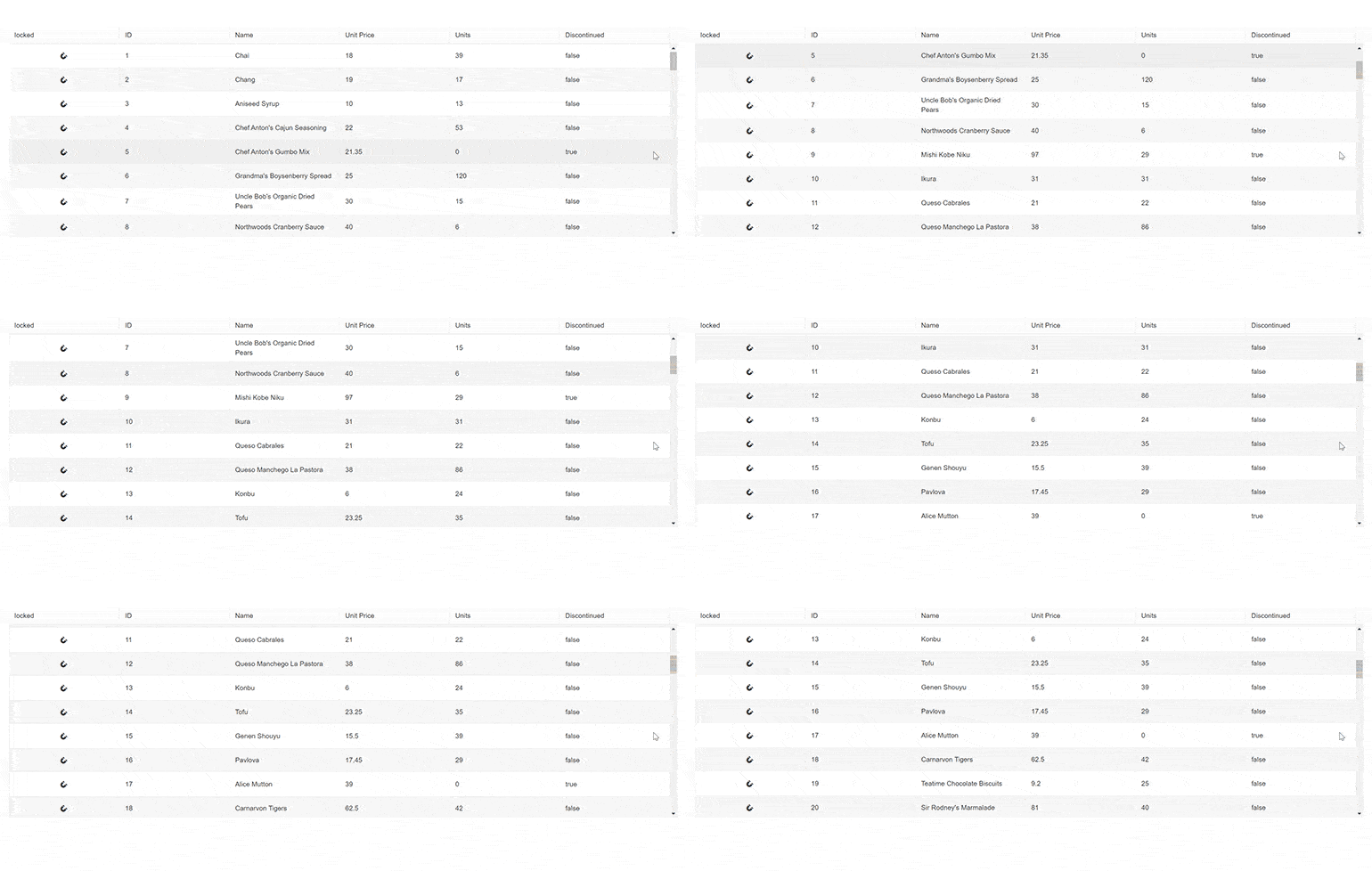
The Vue Data Grid allows you to specify rows to be pinned to the top or the bottom of the viewport. When that is done, they will “stick” to the top or the bottom and remain visible when the user scrolls the view above or below them. The demo shows how this works and how to enable the feature.
See the Vue Data Grid Sticky Rows demo
Vue Data Grid Enhancement: Add All Option to the Pager
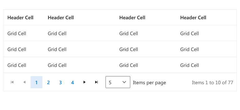
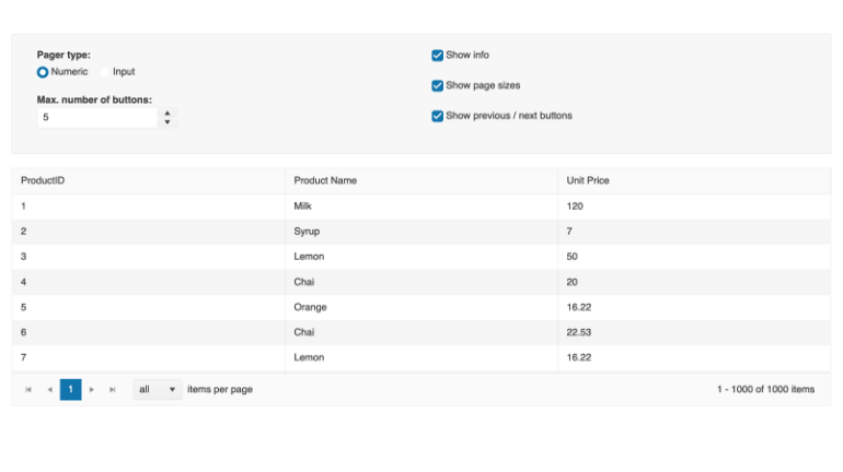
When the pager is implemented, users can choose how many records they’d like to see per page. With this release, users can now opt to see all results rather than being limited to sets such as 10, 20 and 50.
See the Vue Data Grid Pager demo
New Vue Component: Badge
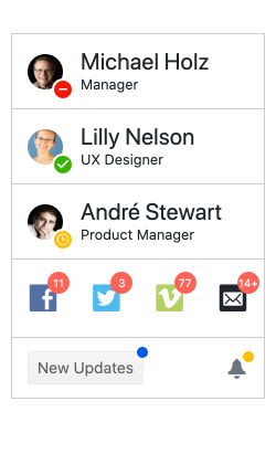
The Kendo UI for Vue Badge component renders a visual indicator common to many apps. It attaches to any element or Vue component and shows the user critical information such as online status or unread messages. A common scenario is the online status displaying your avatar in popular messaging apps.
New Vue Dashboard Sample App
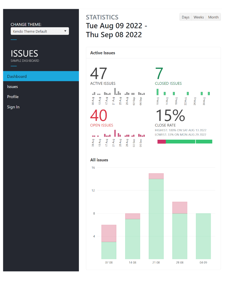
We have rewritten our popular dashboard sample to include 100% native components. Previous versions included a mix of jQuery and native Vue components. Now that we have a well-rounded set of native Vue components, we have been able to make this improvement.
See the Kendo UI for Vue Dashboard Sample Application
New Vue Data Grid Demo: Performance
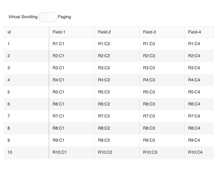
When implementing data grids, performance is a top concern. We address it in various ways with native architecture and features such as virtualization and paging. To help you assess performance and see how these features work, we have added a demo that you can use to set item count and toggle various features.
See the Vue Data Grid Performance demo
New Component: Vue ColorPicker
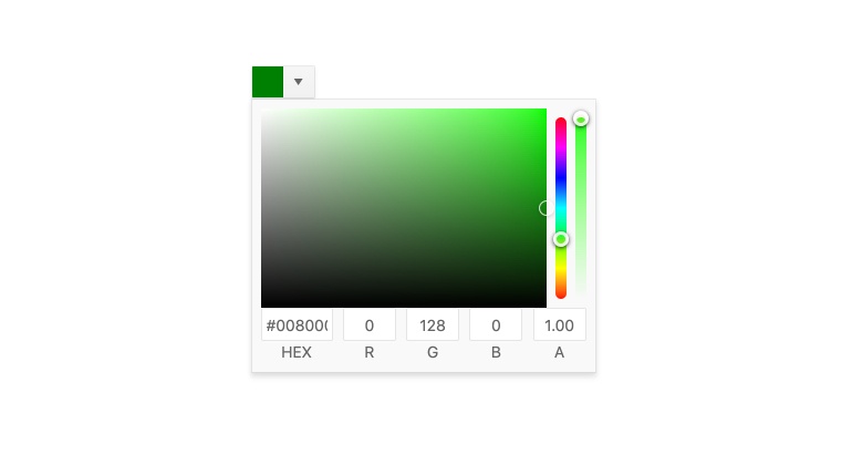
The Vue ColorPicker component helps your users choose colors from a gradient or palette view. It’s a complete color editor that gives users interactive controls for simply selecting a color or altering its opacity, hue, RBG, and Hex values. This component is an alternative to the Vue FlatColorPicker. The ColorPicker component displays the color editor in a popup while the FlatColorPicker renders the editor right on the page.
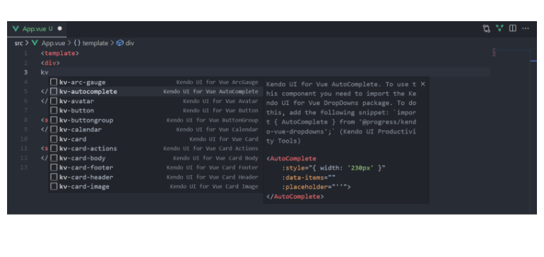
Visual Studio Code Snippets
Via a brand-new extension, Kendo UI Productivity tools for Visual Studio Code, you will now see suggestions for creating Vue components. This means you will be able to add components from the Kendo UI for Vue suite with only a few keystrokes.
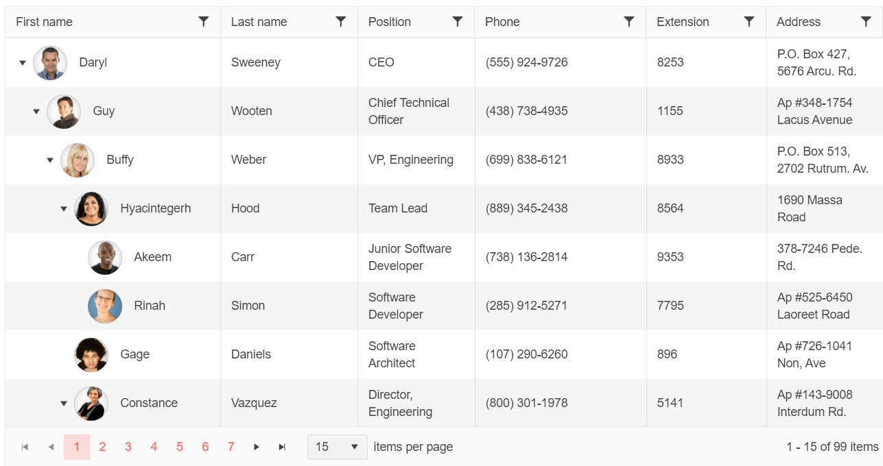
New Vue Component: TreeList
The Vue TreeList component is perfect for data that is homogenous and hierarchical, which means all data items have the same fields and each level aligns its columns with the parent and child elements. You will find the same features you know and enjoy in the Vue Data Grid including sorting, filtering, paging, editing, row and column virtualization and much more.
Vue API Enhancement: valuePrimitive Property Added to DropDownList, ComboBox and MultiSelect Components
Due to popular demand, we have updated the API for select components to include the valuePrimitive property. This will allow you to specify the value-binding behavior. When true, the field will be updated with the selected item text field. When false, the field will be updated with the selected item.
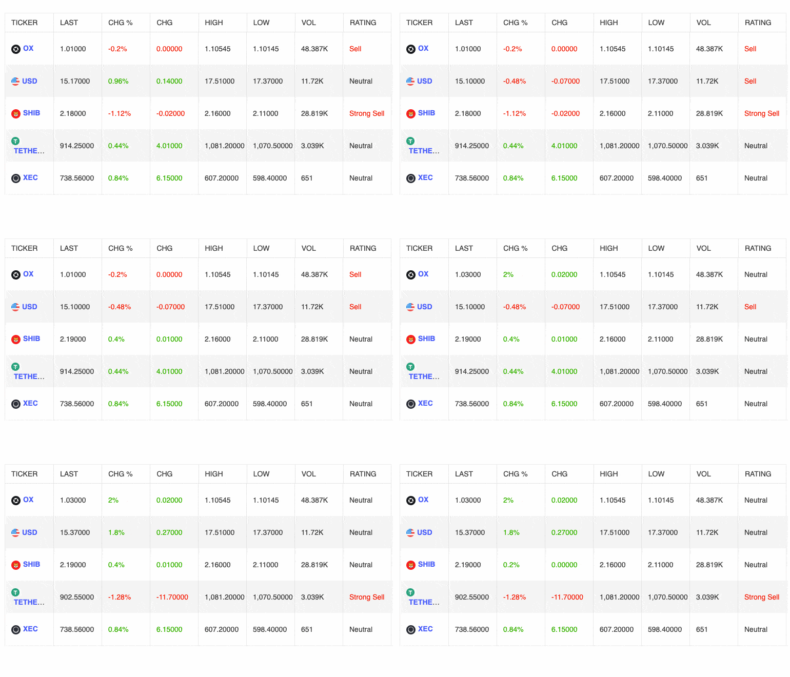
New Vue Data Grid Demo: Live Updating Data
Many developers need to bind the Vue Data Grid to streaming data in order to show updates in real time. While this has many use cases, the most common is stock pricing. This new demo shows how the Data Grid can instantly reflect changes in the data.
See the Vue Data Grid Live Update demo
Kendo UI for Vue - R3 2022
- New Component: Vue FlatColorPicker
- New Vue Theme: Microsoft Fluent Design System
- Vue Inputs Enhancement: Suffixes and Prefixes
- Vue Documentation Enhancement: API Redesign
- New Component: Vue ColorPalette
- Vue Data Grid: Updated Filtering Examples
- Vue Data Grid Enhancement: Loading Indicator
- ThemeBuilder and ThemeBuilder Pro
- Vue Data Grid Enhancement: Filtering, Dynamic Column Display
- New Component: Vue ColorGradient
- New Vue Grid Demo: Sticky Rows
- Vue Data Grid Enhancement: Add All Option to the Pager
- New Vue Component: Badge
- New Vue Dashboard Sample App
- New Vue Data Grid Demo: Performance
- New Component: Vue ColorPicker
- Visual Studio Code Snippets
- New Vue Component: TreeList
- Vue API Enhancement: valuePrimitive Property Added to DropDownList, ComboBox and MultiSelect Components
- New Vue Data Grid Demo: Live Updating Data


